


15-minute architecture
The title "15-minute architecture" was used as a spring board for commentary on today's rapid culture of marketing, branding, and image.
A two-part project: the first task was to re-design the packaging for a given product, in my case Comet cleaning powder; the second half was to create a pop-up store for the new product inside a given space (Liberty Lofts in Ann Arbor).
The packaging design effort draws on research of the product's history, its perception, competitor products, and its position in the market. The final proposal draws inspiration from Comet's established brand colors and the the name itself. The re-designed - Comet - is simple, fresh, and clean. Out-of-this-world-clean. The packaging is designed to be functional and to stand out amongst its store-shelf neighbors. The more square-ish container allows for a greater volume of the cleaning powder, for easier transport, and for two ways of stacking and displaying it on store shelves.


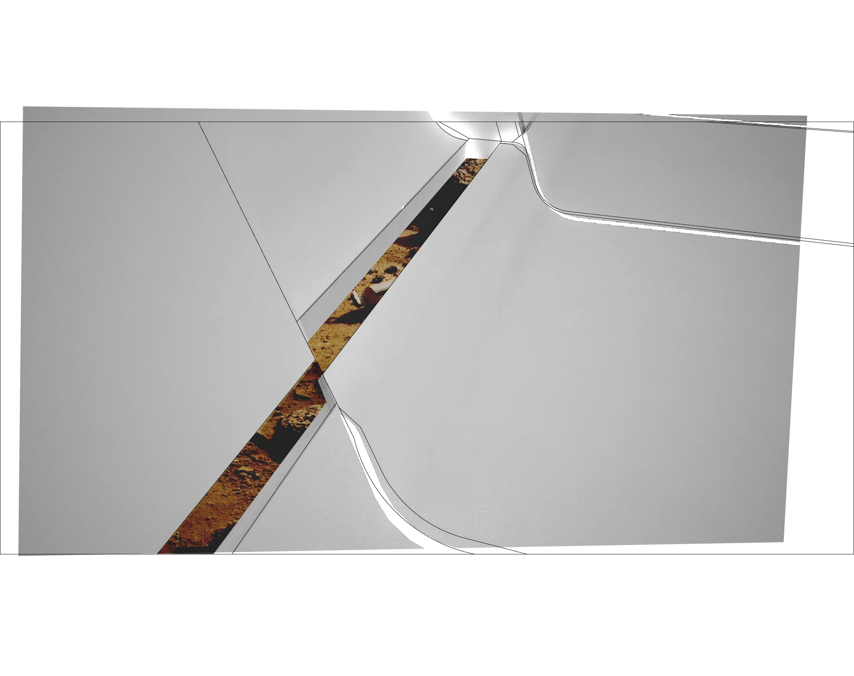

The pop-up shop creates a heightened contrast between cleanliness and messiness fused together with the name "Comet" and the word's associations to outer space. The interactive pop-up offers visitors two choices:
1. To be transported in a pristinely clean spacecraft through time and space to an alien world. Or...
2. To be a 'pioneer on the ground' inspecting a super-clean alien craft that just crash landed.
The space itself sets up parallel experiential sequences--one clean, one dirty--with three types of spaces:
1. An alien object that is grafted onto the existing building's exterior.
2. A strange "limbo" space that mixes objects of cleanliness within an undefined space that is also not clean.
3. A main hall with a distinct separation between a "clean" spacecraft within a "dirty" alien world.