Retroactive Records of Fridays #11

This post records dispatches from July 2017 through December 2017.


July 7, 2017 - "Flat Friday"

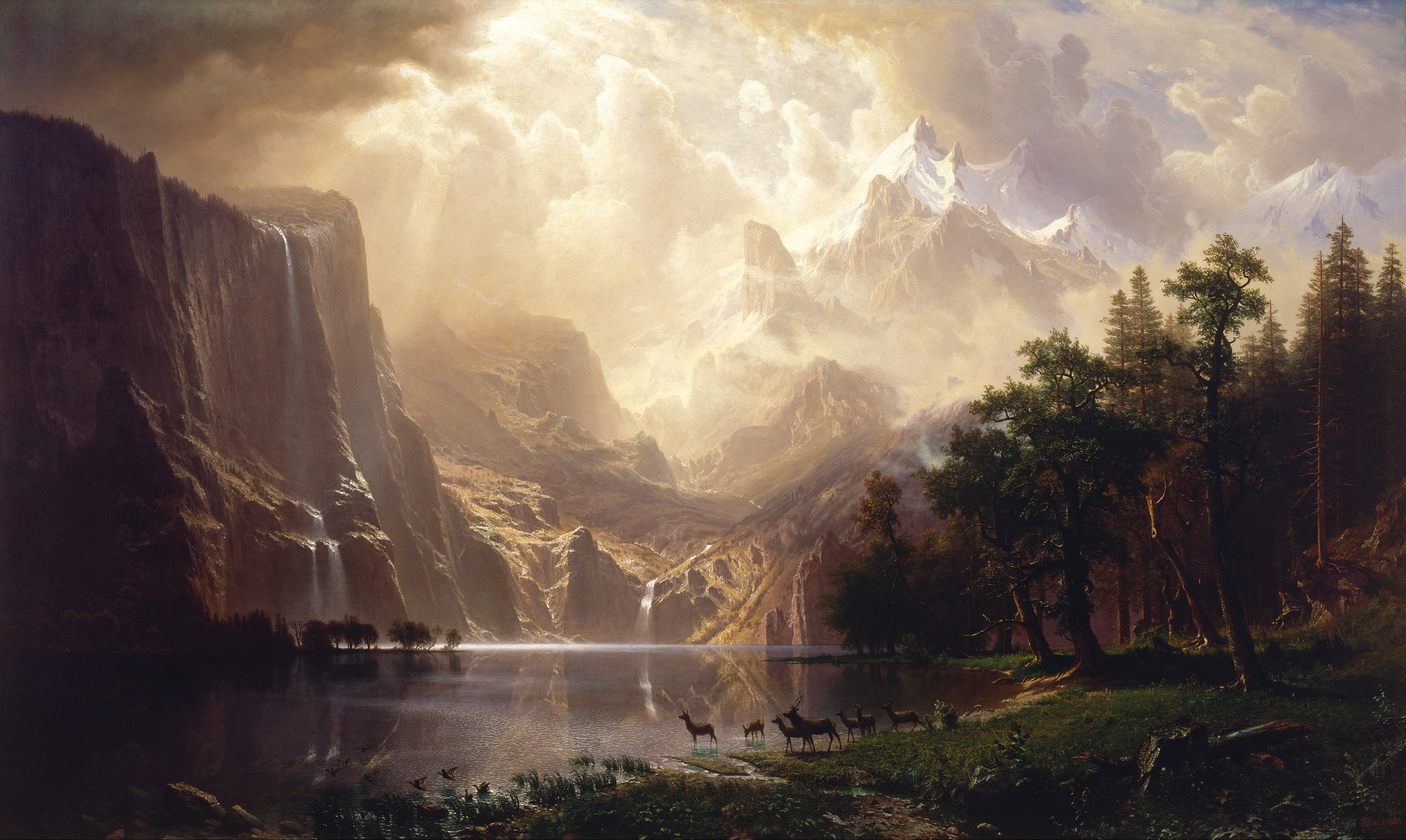
Slat flats are like a dream because I've only seen them in dreams, not IRL. But Murray Fredericks has. He is an Australian photographer who has been working on a series called 'Salt' since 2003, photographing Lake Eyre in the Australian outback. More recently he has also been working on an extension to the series titled 'Vanity', where he hauls a giant mirror with him out to the lake (practical), which both disrupts and introduces a different awareness of the sense of light and space in the images. Lake Eyre is a dried out 3500 sq.mi. lake bed that sits about 50 ft below sea level and is freakin flat. And in the flatness lies the magic. As Fredericks puts it, it is a "landscape without landscape".

Salt
Vanity


July 14, 2017 - "A Spacetime Friday"

Time and space are inextricably linked and it turns out you don't need to be Einstein to know it, duh. But it does help to be bilingual, sí. Actually, Spanish and English won't work in this example. How about Chinese, 是 (Shì), which oddly enough sounds loosely similar to the Spanish "yes"... but on to my real point: 

Language affects the way we visualize time which gets described in spatial terms. For example, English (and Spanish) speakers view time as a continuous line, one that is also oriented horizontally, going backwards and forwards (we look ahead to the future, and look back on the past). Chinese speakers on the other hand put time on a vertical linear axis going up and down. Then there are also cultures with volumetric representations of time. These different linguistic and mental models of time affect the way that we actually perceive time. Language is that powerful, at least this is the argument by Panos Athanasopoulos who co-authored a recent study on the subject. Super fascinating stuff!


July 21, 2017 - "Coffee Table Book Friday"

Maybe the first question should be, do you have a coffee table? Followed by, do you have any books on your coffee table? Or maybe, who cares.

"Look Inside" is a recent book that is a compilation of cutaway graphics. Or maybe it's a little more like a taxonomy because of its wider scope. It makes the middle school me totally nerd out. It also makes the 30-something me totally nerd out. I don't own it, no this isn't a book promo, although the Wired piece basically is, but at least you get to see some of the eye candy that's in the book, and it is certainly cooool.


July 28, 2017 - "Celestial Alignment Friday"

We are getting ready to have a celestial alignment that will temporarily cut a swath of darkness across the country y'all. We are going to have a solar eclipse on August 21, and these events don't occur over easily accessible land that often, especially since only about 30% of the planet's surface area is land, and an even smaller fraction is readily accessible. Thank you Interstate Highway System and the rest of our extensive questionably maintained road network for making it easier to look at things! 

This FiveThirtyEight article features a map of the projected path of the eclipse together with major cities near its path. It touches on some interesting logistics problems. The map is also cool because beyond illustrating the path of darkness and the degree to which a full or partial eclipse will occur, it can also be a map of anticipated congestion -- like a stretched out bottleneck that would temporarily choke off access between two halves of the country... or of a line that will be traced across the country like drawing a line in the sand -- impactful yet fleeting... or serve as a reminder of something that we all share together with all the rest of the strangers out there: a successive series of sunrises and sunsets, all staring up in the same direction. The only thing to not forget though: please don't look directly at the sun, it won't give you superpowers.


August 4, 2017 - "Techno Aesthetic Friday"

This guy - Maxim Zhestkov - creates some cool stuff and puts it on his Vimeo channel. I like it. That's it. Bye.

j/k. He is a designer/animator with a distinct minimal-futuristic sensibility. His films are short, atmospheric, futuristic, abstract, but even then there is always a sense of a story line lurking just outside the frame. The soundtracks are also great and complement the visuals well. That's it. Bye.


August 11, 2017 - "Sub Friday"

A dispatch from mountain time, thinking about a different kind of mountainscape. We seldomly think about what's below, but sometimes someone like Candy Chan does and beautifully documents parts of a city that are often frustrating, sometimes mysterious, and surprisingly uncharted.


August 25, 2017 - "Living Image Friday"

It's not often that an image appears to have a life of its own, but I think Alexey Titarenko has the magic touch. His photographs contain a ghostly life that almost adds a third dimension to the 2d photos. There are old myths about some cultures believing that photographs could steal your soul. Alexey's photographs remind me of these myths, except in addition, they seem to imbue inanimate objects with a shadow of life.


September 1, 2017 - "Understanding Friday's Limits"

I have shared links about maps before, I like maps, maps are my friend (like this 'Urban Layers' of Manhattan from some time back). And with maps, as with anything containing any complexity or involving any communication we are forced to reduce, abstract and make decisions about what stays and what goes. And to that end, this blog post does an excellent job of covering the limitations of maps and I will at this point defer to it.

Below is the full text of the post, or you can follow the link above, which leads you to other good reads.
---

We have seen before that the map is not the territory — that the description of the thing is not the thing itself. Maps can be exceptionally useful. For instance, we can leverage the experiences of others to help us navigate through territories that are, to us, new and unknown. We just have to understand and respect the inherent limitations of maps whose territories may have changed. We have to put some work into really seeing what the maps can show us.

The Perspective
Maps are an abstraction, which means information is lost in order to save space. So perhaps the most important thing we can do before reading a map is to stop and consider what choices have been made in the representation before us.

First, there are some limitations based on the medium used, like paper or digital, and the scale of the territory you are trying to represent. Take the solar system. Our maps of the solar system typically fit on one page. This makes them useful for understanding the order of the planets from the sun but does not even come close to conveying the size of the territory of space.

Bill Bryson explains in A Short History of Nearly Everything, “such are the distances, in fact, that it isn’t possible, in any practical terms, to draw the solar system to scale. … On a diagram of the solar system to scale, with the Earth reduced to about the diameter of a pea, Jupiter would be over a thousand feet away, and Pluto would be a mile and half distant (and about the size of a bacterium, so you wouldn’t be able to see it anyway).”

Maps are furthermore a single visual perspective chosen because you believe it the best one for what you are trying to communicate. This perspective is both literal — what I actually see from my eyes, and figurative — the bias that guides the choices I make.

It’s easy to understand how unique my perspective is. Someone standing three feet away from me is going to have a different perspective than I do. I’ve been totally amazed by the view out of my neighbour’s window.

Jerry Brotton, in his book A History of the World in Twelve Maps, reveals that “the problem of defining where the viewer stands in the relation to a map of the world is one geographers have struggled with for centuries.” Right from the beginning, your starting point becomes your frame of reference, the centre of understanding that everything else links back to.

In an example that should be a classic, but isn’t because of a legacy of visual representation that has yet to change, most of us seriously underestimate the size of Africa. Why? Because, as Tim Marshall explains in his book Prisoners of Geography, most of us use the standard Mercator world map, and “this, as do other maps, depicts a sphere on a flat surface and thus distorts shapes.” A world map always has to be distorted, with a bent toward the view you are trying to present. Which has led to a northern hemisphere centric vision of the world that has been burned into our brains.

Even though Africa looks roughly the size of Greenland, in fact, it is actually about 14 times larger. Don’t use the standard Mercator map to plan your hiking trip!

Knowing a map’s limitations in perspective points you to where you need to bring context. Consider this passage from Marshall’s book: “Africa’s coastline? Great beaches – really, really lovely beaches – but terrible natural harbors. Amazing rivers, but most of them are worthless for actually transporting anything, given that every few miles you go over a waterfall.” A lot of maps wouldn’t show you this – the lines that are rivers are all drawn the same. So you’d look at the success the Europeans had with the Danube or the Rhine and think, why didn’t Africans think to use their rivers in the same way? And then maybe you decide to invest in an African mineral company, bringing to the table the brilliant idea of getting your products to market via river. And then they take you to the waterfalls.

The Author/Cartographer
Consider who draws the maps. A map of the modern day Middle East will probably tell you more about the British and French than any inhabitants of the region. In 1916 a British diplomat named Sykes and a French diplomat name Picot drew a line dividing the territory between their countries based on their interests in the region and not on the cultures of the people living there, or the physical formations that give it form.

Marshall explains, “The region’s very name is based on a European view of the world, and it is a European view of the region that shaped it. The Europeans used ink to draw lines on maps: they were lines that did not exist in reality and created some of the most artificial borders the world has seen. An attempt is now being made to redraw them in blood.”

The map creator is going to bring not only their understanding but also their biases and agenda. Even if your goal is to create the most accurate, unbiased map ever, that intent frames the decisions you make on what to represent and what to leave out. Our relatively new digital mapping makes a decision to respect some privacy at the outset and so Google doesn’t include images of people in its ‘streetview'.

Brotton argues that “a map always manages the reality it tries to show.” And as we have seen before, because there really isn’t one objective reality, maps need to be understood as portraying personal or cultural realities.

“No world map is, or can be, a definitive, transparent depiction of its subject that offers a disembodied eye onto the world.” All maps reflect our understanding of the territory at that moment in time. We change, and maps change with us.

The Territory
This leads to another pitfall. Get the right map. Or better yet, get multiple maps of the same territory. Different explorations require different maps. Don’t get comfortable with one and assume that’s going to explain everything you need. Change the angle.

Derek Hayes, in his Historical Atlas of Toronto, has put together a fascinating pictorial representation of the history of Toronto in maps. Sewer maps, transit maps, maps from before there were any roads, and planning maps for the future. Maps of buildings that were, and maps of buildings that are only dreams. Putting all these together starts to flesh out the context, allowing for an appreciation of a complex city versus a dot on a piece of paper. Maps may never be able to describe the whole territory, but the more you can combine them, the fewer blind spots you will have.

If you compare a map of American naval bases in 1947 with one from 1937, you would notice a huge discrepancy. The number increased significantly. Armed only with this map you might conclude that in addition to fighting in WWII, the Americans invested a lot of resources in base building during the 40s. But if you could get your hands on a map of British naval bases from 1937 you would conclude something entirely different.

As Marshall explains, “In the autumn of 1940, the British desperately needed more warships. The Americans had fifty to spare and so, with what was called the Destroyers for Bases Agreement, the British swapped their ability to be a global power for help in remaining in the war. Almost every British naval base in the Western Hemisphere was handed over.”

The message here is not to give up on maps. They can be wonderful and provide many useful insights. It is rather to understand their limitations. Each map carries the perspective of its creator and is limited by the medium it’s presented in. The more maps you have of a territory, the increased understanding you will have of the complexities of the terrain, allowing you to make better decisions as you navigate through it.


September 15, 2017 - "Re-drawing the Game Friday"

Last friday I was vacationing in China and I did not bring my computer with me (gasp!) nor did I feel like navigating the possible vpn censorship nonsense that is standard practice there (no gasp) despite their government's finger wagging. Perhaps I will revisit this subject in a later dispatch.

This week I'd like to share a ground mural in Italy by GUE. It is a re-drawing of the basketball court that attempts to inscribe the game's plays and actions into the ground in order to make them explicitly visible. Now if you know me at all, I don't really sports, so I can't relate to these basketball inscriptions on the ground, but I do like the idea of the ground taking a more active role of staging or presaging the action. Any sports field already does this to some degree, and if you are watching the game on tv, the commentators scribbling on the screen is an act of faux inscribing the ground. Perhaps for the players, in first person, the ground does this already.


September 22, 2017 - "Real Life Friday"

Is this the real life?
Is this just fantasy? [virtual?]
...
you know the rest!

This is extravagance (that I want to see with my own two eyes).

On a side note, it is astonishingly difficult to find a video like that Queen one on the US web that is not on YouTube.


September 29, 2017 - "Complexity and Contradiction Friday"

I've only breathed the airport air of Hong Kong, and never been to the actual place. I got close. It is on the proverbial list, don't you worry! The main forces attracting me to Hong Kong have been its physical density and geography and the way that the influences of the East vs West have had their impact on the place. That might turn out to be a simplistic impression, but it is one that touches on the contradictions that seem to be embedded in the place. And these complexities are at the heart of a pair of videos (dubbed as 'left channel' and 'right channel') created by Mariana Bisti. The films explore this 'complexity and contradiction', a concept that she borrows from Robert Venturi and which seems to be fitting in this context. Such complexities and contradictions are important at creating a "there" there (to borrow an expression from a former professor), they tease out some things and conceal others. Mariana hints at this in the video description by mentioning the Chinese principle for Hong Kong, which generally translates to "stability and prosperity".

Anyway, the films are done exclusively through a series of drone footage cuts, they are beautiful, drifting between buildings as an alien observer, with some wonderfully framed shots and sequences. O la la. 


October 6, 2017 - "Re-rendered Friday"

Frank Lloyd Wright was probably one of the most prolific architectural figures of the last century. He built many buildings, and designed many buildings that never left the realm of paper architecture (not to be confused with architecture made of paper, for ants). Yet some others that did get realized also got demolished after a very short lifespan (but I thought buildings should last a long time). Now, the spirits of some of those demolished buildings have been revived through digital renderings. Being an architect, I've always been drawn to this form of representation, although the medium has lost a bit of its magic at precisely the point when it is becoming indiscernible from a photograph. Oh the irony.


October 13, 2017 - "Future Food Fridays"

future food friday.png

One of the images in the diptych above is real (guess which one) and the other is fictional.

The top is a still from Blade Runner 2049, it is depicting a fictional yet not so hard to imagine future. Many of the ideas in the film are not looking forward very far and don't require that much suspension of disbelief. This actually makes them more present and tangible. The bottom image is a photo by Luca Locatelli for a National Geographic Magazine feature about super sustainable farming in the Netherlands. The surreal yellow lights are emanating from greenhouses that are increasing their yield by maximizing their growing time. They are really working those plants 24/7. It is a great read, and the article describes pretty futuristic sounding practices and products of technology-enabled techniques that are being deployed today.

Read the article, and then go watch Blade Runner while eating something.


October 20, 2017 - "An Uncanny Friday"

If you've ever watched a movie with digitally rendered characters intended to look like real people, but something about them is not quite right, then you've visited the Uncanny Valley. It's a place that's neither fake nor real, a kind of purgatory. On one side of the valley there are simulated people or objects that are clearly fakes and are not even pretending to be real, so we're cool with that, we like them, we think they're cute! On the other side are fakes that look so real that we can't tell the difference (go watch Blade Runner or West World). But in between, there is this awkward place called the Uncanny Valley and Alan Warburton created a wonderful short film probing not only the valley itself but also touching on other experimental, provocative, and also some mainstream territories that emerged out of this territory in our CGI-filled times.

My favorite segment lives in approximately the middle-third of the film where Warburton talks about "post-truth", "post-cinema", and "theoretical photorealism" as reflections on the current state of media production and consumption. All of this serves as context for musing on what may come next, given that we have now conquered this territory (on screen at least).


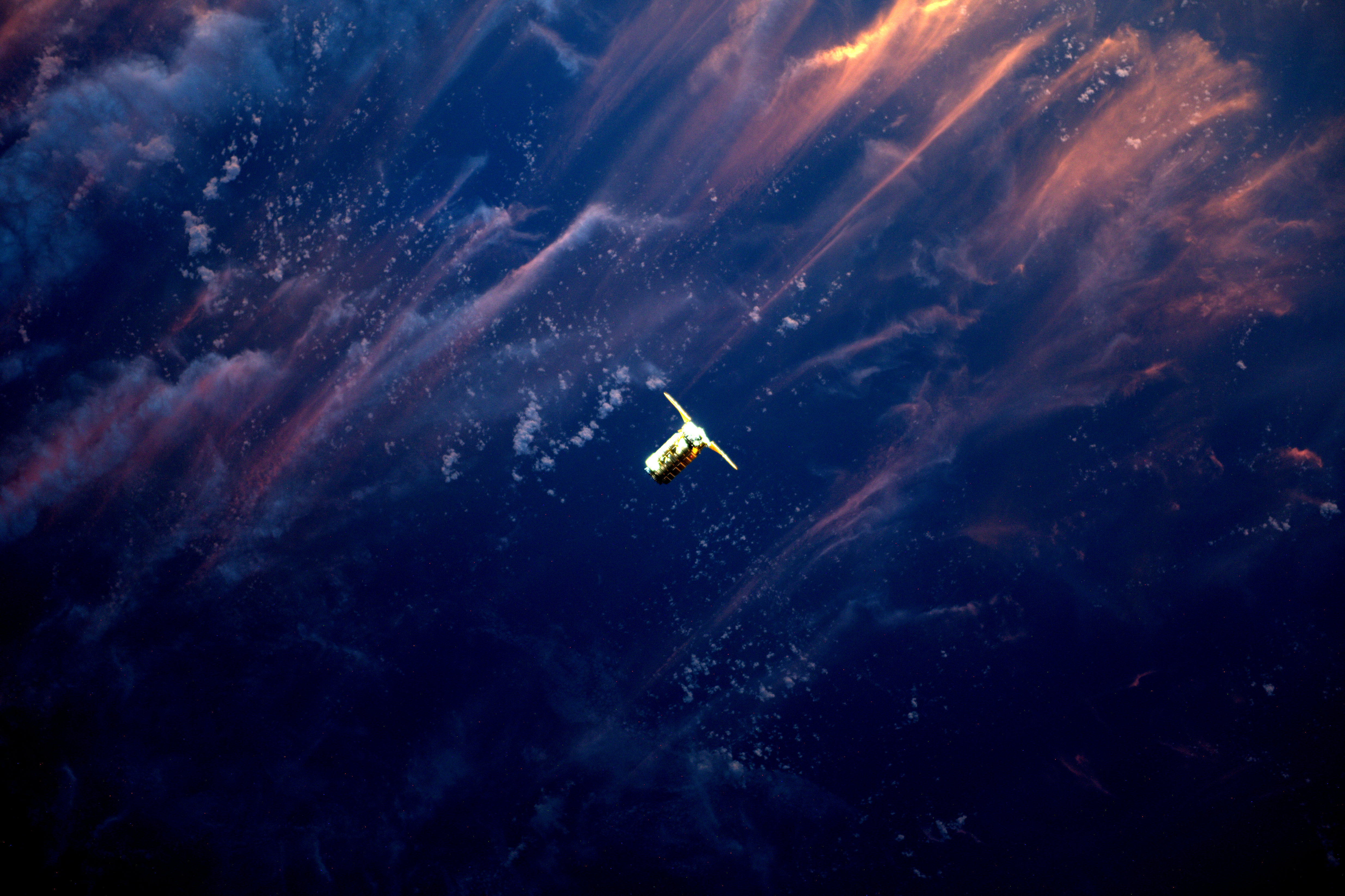
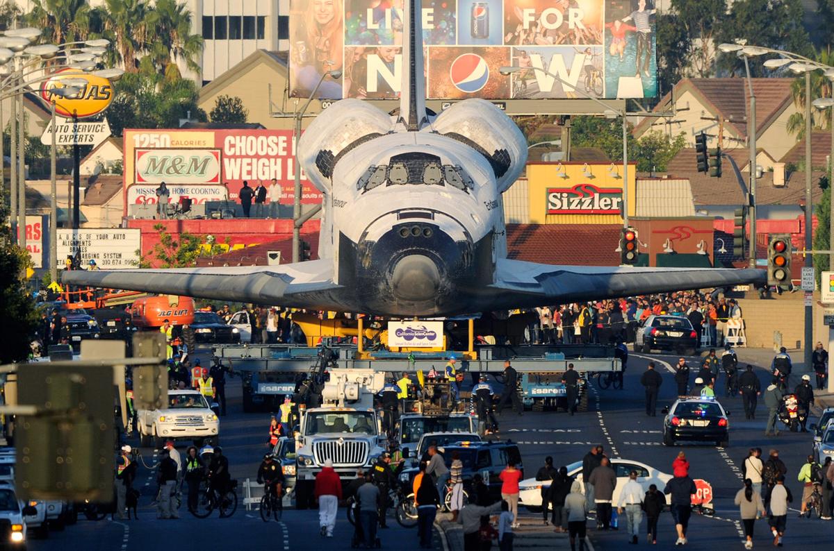
October 27, 2017 - "Spacey Friday"

I love space. Architectural space, interstitial space, tertiary space, cavity space, claustrophobic space, not bloated space, white space, liminal space, and o u t e r space! Outer space is cool! It inspires generations, and sparks countless imaginations. And for all of our creativity, we still can't imagine all of the things in outer space. Space: 1, humans: 0. 

The race to space did inspire a generation during the cold war. It was the commie soviets vs. the capitalist swine! And it was an inspired race that generated a tremendous amount of new knowledge, discoveries, and technologies that we take for granted today like cordless vacuum cleaners. What if the space race never ended? This is a speculative question that artist/illustrator Mac Rebisz is exploring through his series titled "Space That Never Was". His illustrations depict both real and fictional scenarios and they exist in an ambiguous time space of past/present/future due to the soft visual style and because they are grounded in real technologies. It's a lovely project.

p.s. for all we know, we are entering a new era of a [semi-]privatized space race.


November 3, 2017 - "Genre Overload Friday"

Holy musical genre overload! I love music and I suck at music genres (and most anything that is a proper noun) and I can't tell if this creation - named Every Noise at Once - is from a dream or a nightmare. If you click on a name it plays you a tune. Maybe this forest of colorful words representing loud noises is my nightmare.


November 10, 2017 - "Grid Friday"

Gerco de Ruijter has been graphically documenting the Jefferson Grid that is spread across a dominant part of the United States. A more boring name for it is the Public Land Survey System (PLSS), please... we'll stick with the more badass name. If you've ever flown across the US and wondered at the straight square patches of land, you were looking down at the Jefferson Grid. It is a system of subdividing land in the most rational way we humans know, squares. The basic unit is a 1x1 mile square, known as a section. Each section can be further subdivided into a 4x4 grid, or alternatively sections can be aggregated into a larger 6x6 group, known as a township. You get the idea.

There is just one problem with overlaying a grid on the earth, the earth is round. Geometry. This creates a gradual shift between rows of squares as you move up in latitude, requiring a correction, and this is where the project "Grid Corrections" by Gerco de Ruijter wonderfully illustrates this phenomenon. And if you are keen on diving deeper into The Grid, bldgblg has a good post about it. Enjoy The Grid!


November 17, 2017 - "Stretching Time Fridays"

Beautiful Dreamer presents a life story of a girl as a series of one-day episodes with her mother. Or, it is a story of a mother with only two months left to live and choosing to stretch out that time in order to watch her daughter grow up. There is are some intriguing ideas of interaction between us and advancing technology and how it can simultaneously connect and separate us. Plus I always love a story that involves an Einstein theory.


December 1, 2017 - "Keeping the World's Time on Fridays"

One would think that time is not fickle, but apparently it is. At least this is the case with the construct of time as a socio/economic/political tool. Daylight Savings Time is a perfect example. Its intention is to extend the amount of evening daylight hours during the winter months. But who said that one minute it can be 7:59, and the next minute it's 7:00, or 9:00... what a mindfuck if you really think about it. (a little like flying long distances can feel like time travel). 

Luckily we now have computers that automatically adjust all our clocks... except that there are still people operating the computers that push commands to all the other computers that determine whether to move the clocks forward, back, by one hour, or by 30 minutes, and in which country. Whew.


December 8, 2017 - "[un]natural Tapestry Friday"

these images of mines inject awe and fear
the images of fish farms look downright whimsical
and the images of the tulip fields are just as mesmerizing as the ones of the container harbour

These images by Bernhard Lang are of unnatural landscapes, illustrating our tenuous relationship with the natural.


December 15, 2017 - "Opulent Fridays"

This is opulence and extravagance. It is also a stunning piece of engineering. What do you think?


December 22, 2017 - "Heart Friday"

This is happy
Heart!


December 29, 2017 - "Fulfilling Friday"

What is a sustainable, generative and productive kind of work that makes you fulfilled? Only a rare project or work is going to be all that. So maybe we can re-frame the question a little and ask, what feeds you with enough fulfillment that you are willing to work hard past the hardships and the ruts in order to keep going?

Jerry's Map feels like it could be either one, but that's not all. What is magical about it is the constantly evolving nature of the work, that can only be achieved through steady time and effort.

This friday I would like to ask you to respond to me with something that makes you happy. It can be anything, of any scope, duration, seriousness, a thing, or an activity, someone's website, something you do, a personal mini-ritual, or not. It's wide open, as long as it brings a small bit of fulfillment/joy/inspiration to your life. This friday series is a medium for me to share a little of what's on my radar and not every friday is cool and fun, but it's a way to maintain loose contact with you all and it would be wonderful to see a little of what gets your heart beating a little faster.

Happy upcoming New Year!

Retroactive Records of Fridays #10

This post records dispatches from January 2017 through June 2017.


January 6, 2017 - "<- 2017 ---> Friday"

It's a new year. Around this time many people spend reflecting on the previous year and planning for the upcoming year. On the time scale of a day, it actually doesn't matter, January "x" is just another day, keep going. . . But January 1 is special because the idea of a whole new year happens to make people pause. Look up, and take stock. The Earth just completed another orbit around the Sun. Does that matter? What else matters? 

In this spirit, artist Manabu Ikeda's "Rebirth" is a three-year reflection on the 2011 tsunami disaster in Japan. It is a 10 ft x 13 ft piece of meticulous illustrations of numerous stories comprising an overarching image of rebirth and hope. This reflection of a painful past and a hopeful look forward is a story that by its nature is made up of many time scales, is incomplete, and carves out the space within which we can work towards a better day/year/--->

Cheers


January 13, 2017 - "A Landscape Friday"

Landscape now defines much more than just landscape. There are now all sorts of landscapes: political, economic, artistic... The suffix -scape denotes a combining of forms, so the imagery is there to describe the constantly shifting conditions, atmospheres, and attitudes of all these arenas (or landscapes if you will, see how useful that analogy is). 

Landscapes are exactly what come to mind when seeing Herwig Scherabon's data visualizations titled 'Income Inequality' representing exactly that. He is an architect turned graphic designer with a focus on a visual commentary on the interplay between the physical/built world and the intangible factors affecting it. 

The somewhat sublime visual style of 'Income Inequality' definitely reminds me of the Hudson River School with its dramatic topography and high contrast. While the nature of the two is different there are a few similarities. The source material for 'Income Inequality' is hard data, just as the source material for the painters of a century-and-a-half ago was physical reality. However both needed a process of synthesis, editorial/artistic control, and just time and sweat in order to arrive at a snapshot of what we receive as the final product. It is important to stress synthesis and artistic editing because just as the Hudson River School paintings are often embellishments on what the painters actually saw, or whether they are assemblages of multiple landscapes altogether, dataviz work is no doubt subject to a very similar process. Beauty is contentious y'all.


January 20, 2017 - "Shifting Landscapes Friday"

Landscapes shift. Literally. Continents do not sit still people, we just don't live long enough to see it happen. That's kind of our problem.     If you remember last week I referenced "-scapes" as this idea of combining of forms, some of these are able to be seen/sensed better than others. The sun's path across our sky is an example of an easily observed, constantly shifting landscape. And the NY Times has once again produced a beautiful visualization of shadow/daylight patterns of all of NYC indicating how much time each block of the city spends in shadow.

Related, the map also shows how tall each building is and the year of its construction. This is important because the density of New York means that the city regulates daylight access for buildings and new proposed buildings may need to perform shadow impact studies because they obviously affect the shared public realm on the street. The last few years have been witness to a shifting urban landscape in the city with numerous large projects and towers rising across the city. It's hard to imagine their impact before they're built, but once they're there then they're there. So keep your heads up.


January 27, 2017 - "Orient-ation Friday"

Which way is North do you say? Up? Good job, but it wasn't always so and not everywhere. Many of our geography skillz are largely reliant on the assumption that any map we look at is oriented with the North pointing up, even though the original meaning of the word 'orientation' is associated with 'coming from the East'. I for one would be challenged if you were to change the orientation on me. This convention of North being up is convenient but sometimes it is upside down in places like some countries in the Southern hemisphere, which I guess makes sense. Moreover, many early maps from what is now the Middle East were oriented towards the East. All this fascinatingness (yes, fascinatingness is not a real word... blah blah blah, I still typed it twice and spelled it correctly so continue eating your breakfast)... anyway, all this fascinatingness is explained at greater length in a great blog post by Francis Irving.

And if you are more of a hands-on type of gal or guy, then take a crack at this little game by Pentagram that plays with your orientation skillz.


February 3, 2017 - "Ice Friday"

big iceberg
big iceberg closer
more icebergs from a plane, all these images are from NASA's Operation IceBridge whose mission is to study the changes of the Antarctic ice sheet. So does this ice look like it's melting? Does the ice in your ice-water glass look like it's melting?


February 10, 2017 - "Met Friday"

The Met just made available its public domain artworks online free for use under the Creative Commons Zero license, virtually meaning no strings attached. They're hi-res, zoomable and downloadable and there are over 1... 2... 3...375,000 pieces in the collection. Sweet. 


February 17, 2017 - "Data Speak Friday"

Be wary of letting the data speak, you might be there all day. 

But also be even more wary of letting someone else speak for the data, just like letting someone else speak for you. You've got to have trust. Nathan Yau illustrates with a series of data visualization sketches that all use the same data set but illuminate different aspects of the data.


February 24, 2017 - "All Eyes on the Landscape Friday"

Part of photography's magic is being in the right place at the right time. But what if your eye is in all the places all the time? This is what's behind Marcus DeSieno's project "Surveillance Landscapes". He painstakingly scours thousands of open access webcams, traffic cams, weather cams, sketchy cams that are always watching, always feeding the internet, in order to select a few screen captures to edit and present as photography to the world. So there is that. There are also apparently cameras hiding everywhere.


March 3, 2017 - "How Do You Feel This Friday?"

How do you feel?

I feel like I want to be there
on a mountain,
cold crisp air,
silence save for the wind
(ignore the helicopter with the big camera),
poised, not rushed.

(headphones encouraged)


March 10, 2017 - "Topo Motion Friday"

This is a beautiful video by Oskar Rene Fülöp, a German designer. I love the effectiveness of the limited visual palette and the accompanying soundtrack.

Happy friday y'all.


March 17, 2017 - "Get Out Friday"

Austin Kleon's blackout poetry has been a favorite of mine for a while. This mini-series along with the accompanying John Stilgoe quote seem to be becoming more and more astute within the context of our increasingly noisy world, constantly demanding our attention, notifying us of new happenings, the constant threat of fomo hanging out at every turn. Attention and time are renewable, but naturally limited, so get out of the noise every once in a while and don't let the fomo monster get you. p.s. I think my favorite of the four poems is the first one: "what are you hoping to express if all you see is four walls?"


March 24, 2017 - "Martian Friday"

Happy friday y'all!

Some of us may just live to witness a live feed from one of us is flying above the surface of Mars (or as close to "live" as the speed of light will allow at 100 million miles away, give or take 60 million or so... aka 4-14 min). Maybe one of us will be crazy enough to be doing the flying... crazy. But until then, there is this short 3D film that has been stitched together by Jan Fröjdman from thousands of anaglyph images taken by the Mars Reconnaissance Orbiter that is orbiting (duh!) the planet. 

In case you're not familiar with anaglyphs, they are stereoscopic images that split the image into red and cyan channels that you have to look at with a pair of those weird glasses where one lens looks red and the other looks blue, and together you're in 3D!!! The same principle has been used for most 3D movies out there, with the exception of movies like Avatar which use something way cooler. Anyway, Jan's film itself isn't 3D in that sense, but it is in 3D in that the actual 3D topography can be extracted from just some flat stereoscopic images. All that to say, there are some cool landscapes on Mars... except we don't actually know what color they are.

On a side note, Jan's film is a work of love and curiosity. It was created largely quasi-manually in the sense that he had to manually identify thousands of reference points across images in for his stitching software to track. All this work without knowing that there is software out there that will do all that work automatically... Now that there is so much conversation about automation of jobs, it's interesting to think about what this kind of creative effort might also mean.


March 31, 2017 - "Tracking Your Face Friday"

in order to transform it into something else...
3d tracking + projection mapping using high speed projectors = faces on faces on faces

You've seen it done on buildings (which don't move), and maybe on Lady Gaga's face if you watch the Grammys (which also barely moved), but that was an earlier version that couldn't keep up. This new stuff is the real deal.

And this is a little bit about how they did it.

Masks in motion


April 7, 2017 - "My Way or the Highway Friday"

Any of us who have spent any time in the US know highways. There are plenty of other countries with highways, but the US is the birthplace of this spaghetti infrastructure (or circulation system, or vines covering your yard, or a neural network... pick your flavor of an analogy). The way I would define a highway for today's purposes is a controlled-access high-speed road, where access is controlled primarily through on and off-ramps, and it's dedicated only to motor vehicle traffic. Highways are basically pipelines for cars, totally segregated from the outside world in order to facilitate efficient transport of the goods within. That's their goal and they achieve it relatively well. 


Now that we spent all this time defining highways, let's pretend that they were gone. Why? Because Jeff Sisson wants y'all to use your imaginations to imagine what could be through his interactive map that allows you to turn off the highways. At its basic level, his logic is that as a bicyclist or pedestrian, highways are irrelevant, so why are they so dominant on all our maps? However, there are broader and more nuanced reasons if you read his description on the sidebar of the map.

This brings us some of the other reasons for imagining that there are no highways. That is as any good urban planner or urban designer today will tell you, highways create very adverse effects on the fabric around them (whether natural or built). Some of the effects are noise, their massive size, and separation/isolation of neighborhoods/habitats. Have you ever walked under a highway overpass? It's not a happy place. This is why Boston buried a section of I-93 that ran cut through its downtown core in what was known as the Big Dig (the Boston Globe assesses it 10-years after completion and also includes a nice interactive before/after photo). Seattle is currently in the midst of a similar project, the tunnel for which was just finished this week. So it's somewhat of a trend... even Elon Musk is on board, although it's unclear if we should be burying all our problems like that.


April 14, 2017 - "Noisy Noisy Friday"

Last friday was all about highways one adverse effect of which is noise, and we can of course map that. Enter theNational Transportation Noise Map which was just released a couple weeks ago. Thanks to that, we can now see the entire US highway system (and more) as noise.

The other big ticket category is airports, and airports are cool. As an architect and designer, I nerd out about them a little bit, but boy are they noisy. It's understood that proximity to airports and highways depresses property values, increases health risks, and numerous other effects, but I wonder if anyone has mapped this noise effect to the extent that is seen on this noise map. Because the noise from airplanes around airports is like giant crosses or slashes cutting with sound across most cities and towns (or maybe 'scraping' is more appropriate). You can easily gauge the airport's size and runway layout based on its noise map profile.

We are noisy people. Maybe turn it down a couple notches every once in a while, eh?


April 21, 2017 - "Autofoto Friday"

Do you know all those filters that you use for filtering all of your fotos before posting them to instagram? Of course you do! And if you don't, perhaps it's time for you to install wifi under your rock. You also probably know that not-so-little program called Fotoshop Photoshop. All of the powerful things that you can do in Photoshop are to some degree made easier with a smartphone app and some filters, wow. Now the next leap in this process is something that Adobe and Cornell University have cooked up and published in a research paper recently, and it's a program that can take an initial image and an inspiration image, and adapt the inspiration image's style to the initial image. Sounds a little wishy washy, but just look at the fotos then. They are mighty impressive!

The interesting bit is at the end of the article where the author writes about the possible implications of the proliferation of technologies that enable anyone to create anything to look and sound convincing. That's great and powerful and liberating and simultaneously risky and scary. It's maybe not perfectly fitting in this context, but I'm reminded of the idea that the emergence of each invention is the simultaneous invention of its opposite.


April 28, 2017 - "Following the Stars Friday"

Flying through the night,
Reminds me a little of the spirit of Antoine de Saint-Exupéry.
Flying just a bit higher as day emerges from night,
Reminds me a little of the future.


May 5, 2017 - "Unifying Division Friday"

Division has been getting a bad rap lately, so let's try some productive division for a change. Cell division that is, going from 1, to 2, to 4, 8... to.... voila! A living organism. You're welcome. 

Love,
Nature


May 12, 2017 - "Factsfaxfacts Friday"

Oh my goodness there are so many stats and facts on USAFacts about the USA. This is a project initiated by Steve Ballmer (former Microsoft CEO) who gathered a team of some smart people to assemble and cull through tons of government data and Artefact to organize and deliver it all. This is a journey of making sense of all the publicly available data collected by the government about the country. The value here is making the information accessible. A few interesting points: the data source is exclusively government collected data, the authors claim zero bias and no agenda other than to provide information although they do admit to an editing process. All in all though, this is quite a stab at aggregating data and coherently presenting it.


May 19, 2017 - "Cloudy Friday"

Seems like everybody has a requisite travel photo these days that's looking out of an airplane window at some clouds, or the wing and some clouds, or the wing and X city below (guilty as charged); but Santiago Borja's shots of storm clouds and lightning (ah! those lightning shots!) and all the rest of that stuff that's in the sky are better. It helps that he's got the pilot's seat view. 


May 26, 2017 - "Simplicity on Fridays"

The world is complicated. Everything is complicated. You are, I am, we are, your mom is. On some level we all wish for some simplicity, but not just simplicity, not a reductive plainness, but a simplicity that brings clarity and understanding. There is some proverb floating out there in the ether, saying that if you can't explain something very succinctly then you don't truly understand it. Unfortunately, it is exactly a reductive simplicity that is often the catchiest and the one most likely to cause misunderstandings. I recently came across the following quote by Oliver Wendell Holmes that conveys this hope for clarity in understanding:

"I would not give a fig for the simplicity this side of complexity, but I would give my life for the simplicity on the other side of complexity."

Krista Tippett (whose podcast is wonderful and thoughtful and please don't listen to it at 3x speed) wrote that haikus represent a craft of words that attempts to achieve this simplicity that doesn't lose the depth and meaning of complexity behind them. Perhaps that is so.

Writing a haiku can be tricky, but thankfully there is an algorithm for that (the next "there is an app for that"), by none other than the NY Times. It's a bit of an oldie, but definitely still a goodie.


June 2, 2017 - "Nobody is Here Fridays"

Instead of tracking all of the people like everyone else is doing, Nobody lives here is a map showing all the US census blocks with a population of zero.

The mapsbynik blog has a few maps on different subjects and each time the author dives into background history and contextualizes the maps beyond just data points, which is great! Another good one is the Geography of Hardee's--Carl's Jr restaurants. If you compare the two links, the maps kind of match up to each other.


June 9, 2017 - "Mesmerizing Fridays"

Let's just stare at these waves all Friday long, yes? Just say yes.


June 16, 2017 - "Trippy Friday"

Take a trip through a dreamscape inspired by the lights and sounds of Tokyo. This 360° video is totally otherworldly and yet totally appropriate for Tokyo.

Thanks to Sucheta for the link suggestion!


June 23, 2017 - "Futurist Friday"

The Barbican in London is hosting a Science Fiction exhibit this summer, which is definitely my kind of exhibit! I would spend a highly excessive amount of time there. Too bad I'm not in London... :( Anyone want to sponsor a plane ticket? 

Part of this exhibit will show some early editions of a soviet science fiction magazine Tekhnika – Molodezhi (translated as Technology for the Youth), which has been in publication since 1933, and throughout the mid-20th century the magazine put out some amazing and super imaginative artwork. Some of the funky ideas can be seen here, while a more diverse and more interesting artwork can be seen here. There is definitely propaganda scattered in there, duh! There is also emotion, character, and stories!


June 30, 2017 - "Just Google Map It This Friday"

Or Apple map it, or OpenStreetMap it, or Bing map it, or Here map it, whatever map tickles your bones. Let's just be aware that maps are abstractions. We have become so reliant on our newfangled techno-maps that they are often becoming proxies for physical reality. If a place isn't mapped, it doesn't exist. Maps are extremely useful, but they also hide/edit a lot, and a lot of effort that went into their creation. Justin O'Beirne made this side-by-side comparison of the evolution of Apple and Google maps. Each has its own track history of priorities and agendas and graphic decisions.

It helps to build your own sense of direction.

Retroactive Records of Fridays #09

This post records dispatches from August 2016 through December 2016.


August 5, 2016 - "Multiverse Fridays"

This friday, a beautiful video essay. I also enjoyed the inspiration for this film, The Allegory of the Cave from Plato's Republic.


August 12, 2016 - "Tech Wistfully Observing Nature Friday"

There's an almost endless amount of cool stuff that people do with a camera (or two, or sixty) and Photoshop.The latest installment is by photographer Xavi Bou in a series titled Ornitographies that layers photos of birds in flight and exposes the trails of their motion across the frame. He first shoots at 30 to 60 frames per second in order to capture movement after which he layers up up to 600 layers in Photoshop. It's fascinating that with all our technology and flight abilities, we are still not quite able to replicate this type of flight. Sweet.


August 19, 2016 - "Procedural Dance Friday"

The motions of this dancing body are almost real, and yet there is something slightly askew about them, and when paired together with the generic 3d digital "dummy" body, they look even a bit more artificial, calling up thoughts of humanoid robots (hey creeper) and better animations. The modeling and rendering techniques for the bodies in both films are nice and to be fair, the AICP reel went with a different representational choice from CYCLE, but these differences expose the interesting bits. 


August 26, 2016 - "Big Things on the Move Friday"

Remember when they trucked the Space Shuttle Endeavor across Los Angeles at 2mph? I wasn't there, but I wish I had seen it in person. It had to have been an otherworldly sight to see a space plane inching across the mundane urban terrain, surrounded by a uniformed escort in hardhats and reflective vests. This friday I am sharing a short and fantastic read by Geoff Manaugh on moving monumental objects across urban infrastructure. In it, he conjures up images of ancient Roman processions and the large-scale works of Christo, a nice summer friday read.


September 2, 2016 - "Futurism Today Friday"

Blade Runner is one for the books. I gotta say though... they don't write sci-fi like they used to. I don't know, maybe I'm just getting old, but that good ol' sci-fi is just so good. I mean 1982... I don't know, I'm just sayin'.

That stuff is still inspiring people, and Liam Wong's photos of Tokyo are a case in point. CityLab spoke with him and he invoked Syd Mead, and Blade Runner as inspirations. But what's even cooler is that we are living in Blade Runner y'all! ... minus the flying cars and replicants part, but we're getting there. 


September 9, 2016 - "Collecting Friday"

There is something about a collection/collective that can make the individual more interesting. Photographer Cassio Vasconcellos has amassed a number of collections that he has then composed in photoshop into a series titled "Collectives". Although his description for the series aims to communicate the magnitude of our (human) impact, it simultaneously does the reverse by calling attention to the individuals within each collective. And the important component for me is the relationship that forms between the individual and the collective, it's placing the individual within a context that is larger and more unexpected that expected. It is "seeing the forest for the trees".


September 16, 2016 - "Lawful Friday"

We are full of laws. So are parliaments, congresses, and other law-making bodies. Obviously. Our societies are built on sets and layers of laws that we collectively agree to obey. And while much is said and no doubt debated about the politics that go on behind the making of these laws, not much is mentioned about the venues hosting these activities, unless something extraordinary happens. Such extraordinary events (any of the major protests around the world in recent years) tend to highlight certain physicalities that enable them or set the stage for them. But what about the ordinary, routine law-making processes? How does the physical environment of a parliamentary body affect its law-making capacities or tendencies? For instance, do some seating/standing arrangements predispose the participants to more cooperation or opposition? Or to take a slight jump and make an analogy to our own bodies, does sitting up straight, shoulders back, predispose us to a better mood?

This is why I find the Parliament project/book by Max Cohen de Lara and David Mulder van der Vegt - two partners of the young agency of XML - is so intriguing. They catalogued every parliamentary chamber of the 193 UN member states. They visited some of these parliaments and created visual 360-degree views of their main halls the result of which is their website. The website is the interactive (but not comprehensive) half of the project, and in each of the featured chambers, the authors puts the viewer in 2-3 critical positions, such as that of the speaker, the members, or the public. XML attempts to raise awareness for these law-making halls hiding in plain sight by providing a broad examination of the two-sided relationship between the physical configuration of these spaces and the law-making bodies occupying it. 


September 23, 2016 - "Concentrate Friday"

This

is the Crescent Dunes Solar Energy Facility, aka a power plant that is effectively a monumental solar tracking mirror that concentrates the sun on a single point. It's hot. It's sprawling and strangely beautiful. 

Brought to you by the power of focus.


September 30, 2016 - "Tricky Friday"

I've often wondered how do some movie car scenes or commercials get filmed? How much of them are real vs computer generated? There are obviously many ways to do it but here is one cool trick that happens to be a shape-shifting car. Cool!


October 7, 2016 - "Use(ful) Friday"

Have you ever taken something useless and transformed it into something once again useful and felt so proud of yourself that you instagrammed it to the world? Or how about... have you ever wanted to play a game like soccer and then realized that you can't because you only have 30-feet of sidewalk and an active road, but then played it anyway? Well, AP Thailand (a developer) and CJ Worx (an ad agency) took it one step further and made actual playing fields out of useless residual spaces in Bangkok (they made a promo video too). This looks like a great combination of repurposing a residual community space and creatively flexing a sport (something that as kids we did every day).


October 14, 2016 - "Perspective Fridays"

Sometimes we lose sight of the big picture and get lost in the weeds. Getting lost in the weeds is generally not very much fun, because we're lost, determined, but lost. The weeds can be pretty dense, and there are multiple species of weeds and they seem important because they are different, and sometimes differences seem important. And sometimes there is a clearing in the weeds, but it's only a clearing, and the weeds are still all around us.

Sorry for that waste of time back there, but sometimes we need a little jolt reminder to step back for some perspective. 

But seriously, every so often, it's good to ask the big questions about the what and the why? 

And finally, it's interesting that all of those comparisons are about bigness. Bigger = more interesting. Yes, perhaps. That's perhaps why the Donald wants his name bigger everywhere. It's also interesting that many of those comparisons are about man-made things, we live in an age where the things we build are bigger than the typical human can visualize. That's yuge.


October 21, 2016 - "Millennial Friday"

Millennials are all the rage these days. Or maybe we're over it with the millennials already. Whatever your stance is, whether you're pro-millennial or anti-millennial, this recent talk by Simon Sinek is poignant. He runs through a gamut of social/generational issues like technology, instant gratification, empathy, and werkwerkwerk.


October 28, 2016 - "Anthropofriday"

We are definitely leaving our mark on the planet. We are after all trying to name a geologic age after ourselves. What could be bigger? Two geologic ages. The anthropocene - a term for an epoch (an epoch spans several tens-of-millions of years) during which human activities are creating a significant impact on the Earth and its geology - is technically still just a proposal, but the term has been gaining traction. It is difficult to imagine creating an impact large enough to warrant an entire geologic epoch, and that's where the work of people like Edward Burtynsky comes in handy. His latest (out of many anthropocene themed) series of photos depicts expansive salt pans in Gujarat, India. The photos are surreal and look almost like abstract paintings or primitive markings on a canvas. And while they often lack a sense of scale (precisely because they are big), Evan Anderman's series "In Plain Sight" depicts more commonplace settings which most of us have seen through the window of a car but whose extents are hidden until you are looking out the window of a Cessna (or these days... through the eyeball of a drone).


November 4, 2016 - "Fairy Tale Friday"

Like something out of Miyazaki's fairy tale,
with a breath of Murakami's surrealism,
mixing dream with reality.


November 11, 2016 - "Valuable Friday"

"And one of the marvelous things about poetry is that it’s useless. It’s useless. “What use is poetry?” people occasionally ask in the butcher shop, say. They come up to me, and they say, “What use is poetry?” And the answer is no use, but it doesn’t mean to say that it’s without value. It’s without use, but it has value. It has — it is valuable." 


That is poet Michael Longley in conversation with Krista Tippett for her On Being podcast. It's a wonderful excerpt that has meaning beyond poetry. Being valuable and being useful are not always synonymous and that is more important now than ever. You can listen to the excerpt here by fast forwarding to just before the 40:30 mark. The larger conversation is about cherishing the ordinary things that are valuable to us and to our culture. 


November 18, 2016 - "woops on the name"

New York City has mapped and documented all of its street trees. This calls up a few thoughts:
1. This is freaking cool! Various scales of the map show you different levels of detail and information and you can even favorite specific trees.
2. There are currently approximately 685,000 street trees in the five boroughs (these count just the street trees, no parks). There are approximately 1.4 million cars in the five boroughs as of 2010. There are about 304 square miles in the five boroughs as of todayish. 
2.1 Queens has the most street trees, but Manhattan has the highest density of street trees. I was surprised too.
3. I like to think that we have a tendency to start counting things for a few reasons: when we are trying to predict the future, when we want to boast about something or when we are afraid we're going to run out of something. Which is the case here?
4. Thanks Cathy pointing me to this.


December 2, 2016 - "Night Light Friday"

Last Friday was a food-coma recovery holiday, but this week's link is about windows. Windows are more than just an operating system (and hopefully more than a bad joke). They convey architecture's character and allow passing glimpses from the outside in. At night they are all that you see - just constellations of night lights floating in the darkness. Photographer Clarissa Bonet, in her photo project 'Stray Light', likens them to a starry night of our own creation. Each window its own miniature universe. 

And then there is also this photo (make sure to zoom in).


December 9, 2016 - "Drawing Lines on Fridays"

Drawing lines on a map has big consequences IRL. That's how the thought process goes (at least in my head): 1-draw line, 2-consequences. Isn't that sort of how we ended up with so many neatly rectilinear-ly shaped states? IRL it probably often doesn't work that way. The process might go backwards or lines might simply begin to get ignored or blurred, which is what has been going on in the US on a daily basis and is emerging as the acknowledgement of mega-regions*. Smart people are doing research and publishing studies and getting media coverage, so this is not fake, it's real y'all... just maybe not on an officially sanctioned map yet. Although the researchers are still making some cool maps, some of which can be perused here and here!

*A mega-region can be most often identified as a geographic region of interconnected metropolitan areas that may be linked and codependent economically, infrastructurally, ecologically, or culturally (I'm using lots of adverbs today). Different ways of establishing criteria result in different numbers of mega-regions in the US, the number ranges from about 10-20. One can argue that mega-regions would create a better representation of how the country actually works and that's how most of us live out our daily lives anyway, rather than according to quasi-arbitrarily drawn state lines. Various research teams have been studying this area, and the Federal Highway Administration has a number of case studies cited on their website.  ¯\(°_o)/¯


December 16, 2016 - "It's All in Your Head Friday"

I like math, and I'm ok at doing math and actually pretty bad at doing mental math, but this guy loves math and is apparently pretty phenomenal at mental math. Mathemagics! Gotta love me some magic that's not actually magic.


December 23, 2016 - "HdM Elbphilharmonie by Drone"

The Hamburg Elbphilharmonie by Herzon & de Meuron is set to open soon. It's a fancy concert hall and it looks like it was expensive and I want to go visit. The building has some pretty wild architectural features like doubly curved glass panels for some windows, and the plaster work on the interior of the main concert hall itself. And to give you a taste of the building, they had two drones fly through it, which opens a whole new dimension beyond architectural photography. In the video, you can toggle back and forth between the two drones. It's fun. Or if you prefer simpler, there is a side-by-side version.

Retroactive Records of Fridays #08

This post records dispatches from February 2016 through July 2016.


February 5, 2016 - "Perfecting Your Body Friday"

This is the first friday dispatch that I'm doing in a slightly more organized way than just through my email. Hopefully this will be a good way for me to continue to stay in touch with everyone. As always, feedback, links, and suggestions are welcome.

With that said, this week we are working on our bodies. Just as you thought you could give up on your new year's resolution because it's not January anymore, you thought wrong. This video a surprisingly short, yet powerful visual story about Martin Kristensen's work towards perfecting his body as a wing which is not exactly the most common way to use your body unless you're a world class skydiver.

cheers,
Mikhail


February 12, 2016 - "Kaleidoscope Urbanity Friday"

If you didn't know any better (and I didn't), you might think that this photo is the latest in a series of artfully staged shag carpets on top of layers of artisanally molded bread, but it is actually an electron microscope image of a cross section of your retina. Who knew that this mess of layers is how you're able to read these words right now! The photo is the work of Martin Oeggerli, who creates some pretty stunning photographs of the microscopic world. 


February 19, 2016 - "Look Out Your Bathroom Window This Friday"

Take a moment to look out your bathroom window today, there might be a fire station out there living its mysterious life. (And if you don't have a window, too bad... or you can take that moment to look at the reflection off of the bathroom tiles, or the chrome faucet.)


February 26, 2016 - "Zero Clarity Friday"

There seems to be perfect clarity on the climate change issue out there, almost as clear as a 'smog red alert' day in Beijing. This is why Bill Gates is committing one or two billion (give or take) dollars towards finding a breakthrough zero-carbon energy solution. You can listen to him explain it in about two-and-a-half minutes, and while the issue itself is one thing, the clarity in the way that he put it as zero is really what caught my attention.


March 4, 2016 - "What Kind of Friday Are You?"

There are two kinds of fridays out there, one that puts a case on its phone, and one that doesn't. I prefer my fridays with a naked phone.


March 11, 2016 - "Anticipating Friday"

you're nervous... you're in anticipation of... your hands start sweating... chill out, you're fine. You're getting an indirect adrenaline rush just through observing an act of anticipation and not because you're actually nervously anticipating something (all from the warm comfort of your office cubicle, or open office row desk). These moments of anticipation are captured in this photo series/essay for Kinfolk magazine.

Something that really gets my hands sweating are things like this NYTimes feature on Alex Honnold rock-climbing in Yosemite without any safety gear. Or staying with the theme, Google created an awesome Street View experience of ascending the Dawn Wall, now you just need some VR goggles.


March 18, 2016 - "Getting Punched in the Face Friday"

That was sort of a clickbaity subject line, I hate those.

But Seth Godin has what I think a really pointed write up about words and ideas in the culture of today. 

I'll include his text below in addition to the link above, cheers: 

Hot: A theory of propulsion

Words are dead.

To be more clear: Words on a page or on a screen are asleep, inert, doing nothing at all until they interact with you, the reader.

That takes effort.

An audiobook, on the other hand, propels itself. The words are spoken, whether you listen or not, so you better listen.

And a video is just as alive. 

The next level up is new. As in news. Or previously unknown. When it's breaking, it propels itself even harder, because we know that we're about to hear something previously unheard.

And beyond that? When humans are involved. Not just news, but news from a friend. News that our peers are about to be talking about. Not just propelled, but amplified by our cohort and our culture.

Social media is built on the idea of propulsion. It's not history, it's now. The smartphone isn't smart, it's merely hot. Pulsing with the next thing.

[I know, you just got a text. Go check it, I'll be here when you get back.]

This, I think, is one of the giant chasms of our new generation, always seen, not often noticed. That we're moving from the considered words of a book or even a Wikipedia article to the urgent, connected ideas that propel themselves.

Words are a noun, attention is a verb.

The motion of an idea actually creates its own physics. Ideas in motion not only touch more people, they have more impact as well.

Slack is engineered for motion, the Kindle is a silent repository you have to press.

The cliche was that the author used to live for the solitary moments of considered thought and solo writing. "Leave me alone and let me write." The publisher paid the bills with the backlist, the old books that sold and sold. Today, without propulsion, most people aren't making the time or the focus to pursue inert wisdom. Without motion, the words get moldy.

Book publishing (and the making of movies, or songs, or articles) has always had an element of promotion associated with it, the act of introducing an idea to someone who needed it. What's shifted is that the promotion has transcended most of the process, because the idea itselfbecomes the promotion.

It used to be that nothing was more urgent than getting punched in the face. Instant, immediate, personal. Today, we're getting virtual punches, from every direction, all self-propelled, many of them amplified. The ideas that propel themselves on the tailwinds of culture will dominate, opposed only by the people who care enough to propel ideas that matter instead.

Maybe you.


March 25, 2016 - "Abandoned and Unintended Fridays"

Eugene Ashton-Gonzalez has a secret-abandoned-captain's-bridge-control-tower-converted-to-speakeasy overlooking the Bay of San Francisco. Or to be clear it's not his, and it's actually a former signal tower, and he's not supposed to be hauling a piano to it to organize small private concerts, but it's a fascinating example of urban adventure and discovery, of violating lawful boundaries to discover something amazing, forgotten, or unintended. Holy run-on sentence. That last unintended part akin to Geoff Manaugh's upcoming book 'A Burglar's Guide to the City' which is all about using the built environment in unintended ways. There is a kindred spirit between both Eugene's organized excursions and Geoff's ruminations on how to be an architectural burglar.


April 1, 2016 - "Infographic Resume Fridays"

No your resume doesn't need any infographics on it. Infographics are so 2012, or was it 2011... practically ancient history and people just got carried away with them for a while. Just like with Facebook... speaking of the devil, Facebook just recently came out with a study examining the likelihood of professions running in families. It's an interesting study, the graphics are interactive (clumsy if you're on a smartphone), but in reality all of it is a bit difficult to navigate and to understand. This is the trick with big data: effectively communicating all of the bigness and all of the data.

So big data is still going strong. And to help you with sorting through all of it, Microsoft just came out with a nifty interactive data visualization tool called SandDance which lets you interactively sort, select, and visualize data in different ways to hopefully extract new insights. It's nice to see someone working on making tools like this more accessible and to slice and dice all the numbers in a graphically pleasing way. 


April 8, 2016 - "Competing Fridays"

Designing and building a building can be fun and grueling. Going after an architecture commission can be fun and grueling. Speculative architecture competitions can be fun and grueling... you get my drift... But why would you pay money for the honor of such suffering? Maybe I should have asked that question before grad school... j/k... 

You may have heard of the annual eVolo Skyscraper Competition, which is arguably just a money-making and attention-grabbing scheme for faux-chiteture, but attention it does grab, and your money too if you choose to participate. The design prompts are wide open, the winning entries are most often wild, and this year's winning entry proposes to create inverted skyscrapers (bedrockscrapers) by digging up the entirety of NYC's Central Park. Definitely provocative, and someone at CityLab has some strong feelings about all of these provocations. The first 1/3 of the article is about the unpractical nature of the proposal... yawn...  However the last half is about the rise of "meme-tecture", or architecture for the sake of social media consumption and not for the sake of building. It raises interesting questions about the role of drawings and images, which are the media that we architects trade in most often versus the building artifacts themselves. Then there are questions about the value of such speculative work, or even about the value of performing such work for negative money. Lots of questions for you to chew on this friday. Or not.


April 15, 2016 - "Representation Fridays"

Representation in architecture has lately become synonymous with 3d renderings which are getting more and more realistic and pervasive and perhaps a little worn out. So let's see where this trend goes in a few years, but I'd venture a guess that there will be a growing interest in more interpretive/moody/abstract techniques. But don't get me wrong, I love 3d renderings and while we're on this subject, I am a big fan of Factory Fifteen's work. It was started by a small group graduating from Unit 15 at the Bartlett School of Architecture from just a few years ago and they've only gotten better since then, creating some great original work as well as commissioned work. 

Two recent pieces (both of which are beautifully conceived and rendered) are La Geria Vineyard - which was a response to a challenge to use Unreal Engine 4 (a 3d game engine which renders things in real-time as you move through a scene) in an architectural context, and ANA - a collaborative take on the singularity, a bit Terminator style. 


April 22, 2016 - "Pattern Friday"

The geometric patterns in much of Islamic art are mesmerizing. The underlying geometries are seemingly simple but are pretty sophisticated once you start thinking about the rules by which they were created. They are some of the earliest examples of recursive geometry and it's impressive to me that people were able to create these at multiple scales from books to monumental architecture over a millennium ago... without all the fancy computer scripts to help. 

And now there is finally someone making a game for this - Engare - by Mahdi Bahrami. It's not finished yet, so unfortunately you can't waste your friday on it yet claiming that you're "exploring design options". This is all actually really cool because all of these patterns are based on math and rules (that I don't understand but it's going to be in a game so I don't have to crack open a textbook. This is the future of school y'all! Games all around for all your screens... I digress, but surely a juicy topic for another time.) But what I think is almost cooler is that he is planning to release some tools that can be used to generate some of the geometries and patterns that he has created as a byproduct of developing the game. Fun fun!


April 29, 2016 - "Past Future Dreams of Modernity Friday"

Souvenir d’un futur (Memory of a Future), a photo series by Laurent Kronental is a melancholy story of a modern dream. These images are looking back at what was once a futuristic dream, then reality, and now a memory. 

There is a next generation of futuristic dreams on the rise from the likes of Masdar City in the UAE, Songdo City in S.Korea, both of which have gotten their start within the last 10-20 years and are still ongoing experiments. Next, is a big media splash from none other than the big G (oogle).. or I mean the big A (lphabet)... or actually, more specifically Sidewalk Labs (S and L?), which falls under the Alphabet umbrella. Sidewalk Labs is hoping to develop a cutting edge high-tech district (or city). I love the ambitions, and they've allegedly assembled a great team (can I play?) and let's hope that they are indeed keeping perspective as they appear to be. At least according to Dan Doctoroff who's leading the group it appears that they are:

"In part, it's been hard to deliver on, because there really is a gulf between the technologists on the one hand, and let's call them the urbanists on the other," he said. "Where the urbanists and the planners don't really understand technology, the technologists don't really understand cities."


Wear, rinse and repeat. 


May 6, 2016 - "Flat Friday"

The world is flat.
I've seen that film before. Or have I?

"The sky is flat" series is my favorite. 


May 13, 2016 - "Predicting All About Fridays"

Complex Adaptive Systems of Systems! Bless you! That name sounds complex. To help imagine what it means is like imagining what would happen in detail to a large urban region if it was hit by a powerful hurricane. It's a daunting task once you realize that you have to take into account everything from power outages, to blocked roads, to food and fuel supply, effectiveness of emergency response, the public's response, and a myriad of other factors. This is actually a government agency's task, aka some people's job description.

One of the things this reminds me of is another mind-boggling challenge (and this one happens to be one of my favorite 99% Invisible episodes) (also happens to be a government initiative) of designing a means of communicating with ourselves 10,000 years from now. Definitely a more abstract scenario and one that's arguably of a different nature, but still one that asks very wide reaching questions.

Finally, I'm also reminded of (this time not a government agency, but Tom Cruise) the premise of Minority Report, which was to predict and prevent crimes before they happen. We're not doing that much yet, but through the use of data and increasingly smarter software we are slowly and steadily moving towards a more ubiquitous and visible prediction industry. 


May 20, 2016 - "Cultural Friday"

I like art. Do you like art? Do you like to see your art so close that you can almost lick it? Are you disappointed that real museums don't actually let you lick the art? Well then the Google Cultural Institute (and with a fancy accent) is just for you! 

Google is out to catalogue artworks much like with their Google Books project. This time they built an automated camera that incorporates some cool tech to bring you gigapixel sized images of artworks around which you can zoom around at inch level details (a.k.a. close enough you can almost lick it). If you're interested in reading a little bit more about it, they have a brief blog post on it, otherwise just jump to the first link here and try it out. 

Now on a geeky note... since their camera already incorporates sonar and laser, wouldn't it be sweet if these images offered haptic (touch) feedback? This way you could actually touch the brush strokes.


May 27, 2016 - "Invisible to the Eye Fridays"

The Little Prince is one of my favorite books/stories. It's all about imagination and the importance of the intangible. There is apparently an animated film coming out later this year whose plot loosely orbits this story, but within the film are a series of stop-motion sequences that re-tell the actual story of The Little Prince and they look stunning. 


June 3, 2016 - "Relearn Fridays"

Could you unlearn how to ride a bicycle only to relearn to do it differently? Easy? Or maybe not so easy. This is a pretty crazy video, that to me, demonstrates how our minds and bodies rely on so much autopilot and habits and how difficult (but still possible!) it can be to unlearn something. 


June 10, 2016 - "What's on the Menu on Fridays"

You can choose from over 17,000 menus if you wish. Multiply that by some number of dishes per menu and you have a lot of choices. These 17,000 menus are a fraction of New York Public Library's physical collection of menus, which number around 45,000. Maybe they can start a daily special so we don't have to choose from so many options.


June 17, 2016 - "Time Lapse Fridays"

I don't know about you, but when I look at something, I don't stand there and stare at it for 24 hours to see what happens. That's what time lapse photography is for, and boy has it proliferated over the last several years. Even your mom can do it now with an app on her smartphone. It's a form of photography that beautifully captures changes through time and it is exactly this nature of standing in one spot for 24 hours staring at something (or in this case, staring at your camera stare at something) that used to keep time lapse from becoming very popular. Until now, when processing software, cheaper and easier to use camera hardware and accessories have made it much easier to watch your camera do its thing (and maybe sip on a bottle of bourbon while you're waiting).

But it is still exactly this extended time commitment that makes this particular time-lapse film by photographer Keith Loutit so cool to me. The project required him to return to various, precise spots in Singapore over different periods of time ranging from weeks to years. It also helps that there is a sweet soundtrack and the artistic concept give the film a bit of narrative and all the light trails of cars make me think of Drive.


June 24, 2016 - "More Pattern Fridays"

Terrapattern is an interesting visual search engine that looks for patterns in satellite imagery based on a given image sample. It could be a pretty useful tool for anyone who works across large city-scale projects. It's based on machine-learning, a pretty hot topic right now. At the moment, you can only use Terrapattern only in a handful of cities, I'm guessing they have to go through a certain amount of subdividing and image analysis of each region before making it available for search. The project is in its early stages but still a cool tool.


July 1, 2016 - "Kaleidoscope Urbanity Friday"

a nice video of city views kaleidoscoped together, and still shots of an imaginary city put together by an algorithm that happens to look like a kaleidoscope on an acid trip.


July 8, 2016 - "Sketch from Memory Friday"

Hi all! It's finally hot here in New York. This week we're all going to sketch an object purely from memory, your favorite mug. There's a certain amount of joy that emerges from the details that you will remember or disbelief from the details that you don't. It's a fun exercise that Gianluca Gimini turned into a project titled Velocipedia. He asked people to sketch him a bicycle from memory and then took those sketches and turned them into photorealistic images. Fun and wacky bikes emerged!


July 15, 2016 - "Personal Data Friday"

This is a beautiful reflection between two women (and voluntary, and totally analog) on getting to know someone through visualizations of personal data. Not only does this data have character, but it makes explicit the notion that what matters in the end is what you make of it not what it is. Happy friday y'all.


July 22, 2016 - "One Year Friday"

One year of images of our planet from the permanently sunlit direction. These are beautiful. 

A fascinating nerdy aside is that these images were taken from a satellite positioned at a point in space called LaGrange-1, which is a place where the gravitational pull of the Earth is in equilibrium to that of the Sun making it possible to place something like a satellite there and have it "stay still" relative to these two bodies. There are a number of these LaGrange points, and 99% Invisible recently aired an episode about LaGrange-5.


July 29, 2016 - "Immaterials Friday"

Every once in a while we catch ourselves watching the tiny little reception bars on our phones, possibly looking like idiots, holding our phones in different positions trying to magically catch an additional bar of reception. The signal we're trying to catch is invisible, but what if you wanted to see it? Well, someone made an app for it of course. It's called White Spots, with the idea being that on when in the app, the map feature shows the "out-of-signal" areas in white space. The subtext here is that these spots are becoming increasingly hard to find, especially in the developed parts of the world.

I've come across a few other projects tackling this notion of "Hertzian Space", or space that is better defined by and occupied by the devices surrounding us which are operating at frequencies invisible to any of our five senses. These past attempts all try visualizing this other space, in a way an attempt at augmenting our perception (except for the fourth one) in order to peer into an invisible world. These all date back to around 2008-2011, with the exception of the fourth one, which dates back all the way to 1980.

Immaterials - a project visualizing the strength of wifi signals with a movable LED light bar and long-exposure photography. I like the snow tracks tracking the trackers.

Touch - a project by the London group, Berg, that deals with the super close range devices like NFC and RFID chips. Cute.

Immaterials - are you seeing a naming pattern emerge yet? Visually, this is my favorite project out of the bunch. Cyber bubbles.

Hole in Space - this was an unannounced 3-night installation of a giant public video chat between NYC and LA. While we all barely think twice about facetiming/skyping/whatever someone, this was done in 1980! That's 36 years ago, and most people have never experienced such a connection, which was was quite aptly named as a hole in space. 

Retroactive Records of Fridays #07

This post records dispatches from October 2015 through January 2016.


October 2, 2015 - "To Scale Fridays"

We architects can get very serious about scale. 

Is this drawing to scale?

What scale is this at?

You have to think about the scale of the space!

Where is the scale? I can't tell what scale this is! You need at least a graphic scale!

This space has no sense of scale!

This has such a human scale to it!

But sometimes when talking about space, all this talk about scale is just not enough and you need to build a to-scale mockup of the solar system.


October 9, 2015 - "Spacey Friday"

This week is space week. I didn’t know that either. But NASA scanned and published on flickr a whole crapload of images from the Apollo moon missions. And looking at some of them at high-res is pretty sweet. Those dudes took a lot of photos. Tourists. 

this one is definitely an album cover.

And didn’t your mother ever teach you not to climb under moon rocks?

Or look at that sliver of blue on the right.


October 16, 2015 - "Joined at the Palm Friday"

“The joining of people to devices has been rapid and unalterable.”

Doge would respond - Such truth.

How much time do you spend with your phone while spending time with other people? It seems that the photo series "Removed" by Eric Pickersgill really critiques the fact that my phone might as well be glued to my hand, which maybe it would be better that way, wouldn't' have to buy a case to protect it from being dropped. And maybe that person sitting next to me glued to their phone might as well be video chatting with me from three time zones away. The images really bring into focus something that we experience every day, and have become virtually blind to in a matter of only several years. 


October 23, 2015 - "Margin Fridays"

mar·gin

ˈmärjən/

noun

  1. 1.

    the edge or border of something.

    "the eastern margin of the Indian Ocean

  2. 2.

    an amount by which a thing is won or falls short.

    "they won by a convincing 17-point margin"


Now, how about this definition:

"Margin is the space between our load and our limits."

I love this notion of a margin in life, and as a designer, the parallel to a margin on a page is just too good to pass by. Page margins give the page breathing room, make it more readable, etc... just like a margin in life makes it more livable. This week is an uncommon deviation on my part into slightly soapboxy territory (and actually requires you to read, gasp... but it's only a 6 minute read), but as designers in one way or another, we need those margins, those white spaces, to take stock, compose ourselves, and to imagine exciting trajectories.


October 30, 2015 - "Injected Reality Fridays"

It seems like virtual reality and augmented reality are the talk of the block these days... with architects jumping on board, new VR games popping up, etc.

One of the players in the game is Magic Leap, an intriguing and secretive augmented reality startup. Or at least that is the internet's best guess as to what it is they're actually doing. After watching their demo/teaser video, I would venture to call it an injected reality. It's like virtual and augmented reality bleeding together... what sets this apart from augmented reality is that it's not layering some ghostly data bubbles on top of a real-world object, but instead it injects a virtual, real-looking object that can interact with your real-world... c-r-a-z-y . . . 

and definitely magic for sure.


November 6, 2015 - "Drop a Pin Friday"

What will your mental map of where you are look like? 

Will it just be represented by the few steps of navigating to your Google Maps icon on your smartphone... and after that why would you need a mental map when you have a legit one in the palm of your hand that tells you exactly where you are and even which way you're pointing? 

Answering the question at the top, a guy by the name of Archie Archambault (what a name) has created a series of mental maps, a bit in the spirit of psychogeography, the Situationists, derive, etc... 

The reason and interest in the mental maps is linked to this article, claiming that GPS directions allow us the luxury of spatial non-awareness. a.k.a. you can follow turn-by-turn directions just fine but later will be incapable of finding your way by yourself. So you learned nothing (and might as well just go back to bed), and according to a cited study in the article, some people "even failed to recognize that they’d been led past certain places twice from different angles."

So all that to say, it's fantastic to have your phone navigate you to a dropped pin on a map, but look around and enjoy the scenery because what if the next time your phone dies... you don't want to be passing the same McDonald's over and over again.

p.s. all this also makes me think of treasure maps, where X marks the spot, and you have to really really pay attention to your surroundings if you ever want to find the treasure!


November 13, 2015 - "Internet Friday"

Isn't every friday an internet friday? 

Or maybe it was every monday...

In any case, many of us take the internet for granted. It's become almost something of a standard utility, like the telephone. We just expect to be able to have access to it. And like most infrastructure of this kind, its massive inner workings and difficult to wrap your head around. There is a tool out there put out by Harvard's Berkman Center, theInternet Monitor Dashboard, that at least helps you a little bit in visualizing some aspects of the internet by country or by certain types of access. One of the more interesting widgets for me are the live Wikipedia edits.


November 20, 2015 - "Your Design Friday"

Design ownership/authorship is a big sensitive gray fog of vaguely defined dimensions… foggy enough? One thing is pretty clear to one French interior designer, which is that she is suing darling Airbnb for copying her home in a portion of their fancy new San Francisco headquarters which were designed by Gensler (some more on the project here). Many discussions can be had about the nature of creativity, originality, and authorship, such as singular vs. team origins, to what degree is a design a design before it becomes another design?

To my knowledge there isn’t a clear or consistent agreement on the subject, and for me it all comes down to personal values and judgement calls, which are in the grand scheme of things no less foggy, but at least the fog is more personal, more familiar, more homey.


December 4, 2015 - "Slightly Nostalgic Friday"

There was no dispatch last Friday because the only email you should have been checking for is shopping receipts.

j/k.

or not.

In any case, a little distraction today with OldNYC (thanks Philip), which is a cool project that takes old NY Public Library photos and maps them to their actual locations. What would be even cooler is to superimpose them over current photos, maybe even on top of historical Google Earth satellite imagery.


December 11, 2015 - "GIFriday"

Do you pronounce it “Gif” or “Jif”?

Has it made into the Oxford English dictionary yet?

Do you care?

Guillaume Kurkdjian produces these amusing adorable GIFs (there are different series on various themes), which you can scroll through either on his site or his Tumblr.


December 18, 2015 - "Geek Friday"

Yes, Star Wars just came out and I don’t know why the world isn’t at a standstill. What’s somewhat interesting about Star Wars is, as geeky as it is, the story and movies are not about the techy nerdy stuff of super computers, lasers and blinky lights, those things are secondary material. But the things that are more about the blinky lights are actually mostly closer to home.

Perception is a firm that designs the future of UI… maybe not literally, or maybe literally… they won’t tell, but they have designed computer user interfaces for Marvel movies like Iron Man and others, they’re also working with a bunch of big companies on real world projects. One of the first standout examples of this type of work (not done by Perception) was for Minority Report where Tom Cruise has this giant floating holographic computer that he controls with gestures, I was blown away. But regardless of how real those movies are, this type of sci-fi work inspires many real world products (perhaps not actually, I’m speculating here), but think the Nintendo Wii or car dashboards or parts of your smartphone’s interface. Think big.


January 8, 2016 - "Giga Friday"

The fancily named mountain that has a pen named after it, Mont Blanc, now also has the largest panorama in the world (Guinness says so, so it’s gotta be legit). It’s over 385 gigapixels… I don’t actually know how big that is, but it clearly required a bunch of people hauling a bunch of expensive and heavy glass up to a height of 3500m.

It’s an interactive photo so that you can pan around and zoom in, really zoom in, really.. until you can read the words on the construction site happening on the left.

And just look at all that glorious snow that can be skied on!!!


January 15, 2016 - "Still Time Friday"

Photography is all about capturing a moment in time, freezing an infinitesimally thin slice of infinity. An obvious challenge becomes conveying time through the medium. Three photo series by three different photographers capture the passage of time to create images of almost otherworldly qualities that collapse a stretch of time down to just a moment:

Stephen Wilkes’ “Day to Night” series collapses time into a seamless image (kudos to Emily S. for the pointer). Thanks to Artsy for providing more info about Wilkes and his work.

Matt Molloy’s technique creates a very painterly effect by focusing on motion to show passage of time.

Fong Qi Wei’s “Time is a Dimension” series has a strong graphic element to it and made some popular rounds through the internetz a couple years ago, and is probably a favorite of mine out of the bunch.


January 22, 2016 - "Archifiction Friday"

Snippets from an other Tokyo.

In other news, I plan to move this little dispatch over to something like Mailchimp or Tinyletter in the next week or two. Yup yup.


January 29, 2016 - "Cross Section Friday"

Can you imagine slicing a building in half and lifting off one side so that you can see inside? The architects out there are probably thinking “well duh! I do that in my sleep.” Well good for all of you.  Next challenge: do the same trick through a 620-foot long cargo ship filled with 2,800 cars at the bottom of the English Channel. 

This is a bit of way old news circa 2002, but someone had to do it, and it was a Dutch company that had to slice this cargo ship with 2800 cars inside into 9 sections in order to lift it out of the water after it collided with another ship and sank. If anything, the captions are entertaining.

This also makes me think of Gordon Matta Clark’s work of slicing through buildings… an entirely different context but both very revealing.

Retroactive Records of Fridays #06

This post records dispatches from July 2015 through September 2015.


July 10, 2015 - "Incepting an Image of a Friday"

If you thought that Inception was a bit mind bending, or just confusing as hell, try doing a bit of mind bending on a computer… even more confusing? I don’t know, but basically, there is such a thing called machine learning. In a nutshell you can teach a computer to recognize something like a banana by showing it a lot of images of bananas and telling it that these are bananas. The point is to let it build up an internal database of all possible ways and settings in which a banana can appear (get your mind out of the gutter now). So that when it’s taught, it will be able to identify a banana in a given image.

Where this becomes interesting is after you’ve taught the computer what a banana looks like, what does it actually look like as an internal mental image? In other words, if you asked it to spit out an image of a banana from nothing, what would you get? You get very interesting and surprisingly eye-opening results.

Where the idea of inception pops in is since you’ve taught the computer to recognize bananas, it will then by nature start seeing bananas everywhere, and boy does that world get bizzare.

Sweet mindblowing dreams y’all.

July 17, 2015 - "Full of Wonder Friday"

This week has seen Pluto (the planet, not the dog) in the news quite a lot, and the New Horizons spacecraft that’s sending back all these images (only 4.5 hours of travel time at the speed of light) is incidentally powered by Plutonium, but I digress.

A little closer to home, Japan recently launched an Earth observing weather satellite that takes one pretty incredible image every 10 minutes. And wow I want a bigger screen!.

And a little closer to home still, actually on the surface of our planet, just a little upside down maybe, you can send an email to your favorite tree

Technology is magic.

July 24, 2015 - "Dotmap Friday"

It’s always cool to see what a bunch of data can reveal when paired with a bunch of code (and put on a map). For example, this one uses census data to map race across the country. And this second one was actually inspired by the racial map and it uses census data to map jobs across the country. Now someone should cross reference the two and make a third map. This starts to get at the trick with all these enormous sets of data, what does it mean and what do you do with it? Or you just say “wow” and move on with your day. So with that said… Uber is offering ice cream delivery today…

July 31, 2015 - "You're Always on Display on Friday"

The fourth wall is the wall behind the stage of a traditional proscenium theater. This is the surface that we're all staring at when we go see a traditional play, watch a movie screen, or a TV screen. But this is a 2-sided surface. "The fourth wall" is a photo series by German photographer Klaus Frahm that looks out from behind the stage at the audience, who now become the actors. 

Also not quite related, if you're conveniently located to see the south face of the Empire State Building tomorrow night from 9pm-midnight, you should take a look.

August 7, 2015 - "See-through Friday"

No, not that kind of see-through.

We officially have the ability to easily remove obstructions from photos. We have none other to thank than Google + MIT who have developed a way of algorithmically removing reflections and obstructions from photos (such as chainlink fences for us construction-site-try-to-stick-your-camera-through-the-fence-without-dropping-it types). The principle by which the software works makes perfect sense (which is partly why our two bio eyes still give us such an advantage over cameras), but the apparent resiliency and fidelity of the output images are pretty incredible. It can spit out both the unobstructed image and an image of the obstructor, both with amazing clarity.

So you can now take selfies without actually taking selfies!

August 21, 2015 - "Off-limits Friday"

This has nothing to do with Hillary's servergate, but a different kind of restricted area, one that's more mysterious. Danila Tkachenko's photos of seemingly-ancient former Soviet military testing grounds, research towns, and interplanetary communications facilities are very post apocalyptic and so in the spirit of ruin-porn, but better.

Such ruin! Much white!

(thanks to Connie Cortes for the link!)

August 28, 2015 - "Slightly Surreal Friday"

White,, water,, and just slightly off kilter.

September 4, 2015 - "Yellow Friday"

Yellow is the color of our sun.

That was a lie. 

The answer is red.

That was a lie too. 

The actual color is white.

Disappointed? It’s ok, at least the sun isn’t racist, but is all inclusive, like all colors of the rainbow put together = white-light kind of inclusive.

But back to yellow. It’s a convenient representation of the sun’s light, and Mapdwell has mapped the energy potential of photovoltaic panels for every roof in NYC, as well as a few other major cities.

Pretty incredible. Google has a similar project on a less granular and more global level. Except they use red as the color representing highest solar potential, as opposed to yellow for Mapdwell. It’s all in the eye of the beholder. Just don’t try to actually look at the sun to see what color it is.

September 11, 2015 - "Classy Space Drunks Friday"

Ballantine’s has designed a whiskey glass for space because you know, this is a real out of this world problem. But I love the idea that someone has spent time thinking about this and has developed a consumer product that can now be featured on that Mars One reality tv show… But seriously, the design challenges are intriguing if nothing else. The website explains the design and has a couple videos, one is a digital promo, and the other a behind the scenes of design & testing.

So now we can have you know… drunk astronauts orbiting the Earth 200 miles up in a space station flying at 17,000 mph… what could go wrong?

September 25, 2015 - "Landing Rockets on Fridays"

Space X, the company run by Elon Musk, the guy who also runs Tesla cars, and one day might run high speed vacuum tube trains, and ….

So back to Space X, who is building a reusable rocket (the Falcon 9) that will help launch shit into space, because right now rockets are disposable... Yep, just like that plastic cup you’re using for your beer pong game this morning. They’re still experimenting… as you can tell by the fireworks, but they’ve come pretty darn close to building a fully autonomous 224-ft rocket that lands itself upright. Some of us would have trouble balancing a matchstick on a tabletop… But luckily, some bored geniuses at MIT built a game just so that you can take a stab or two or 47 at landing the Falcon 9 on your own. Just use the arrow keys.

retroactive records of fridays #05

This post records dispatches from February 2015 through June 2015.


february 6, 2015 - "nice pattern friday"

Sometimes I just want to see a nice pattern out there.

february 13, 2015 - "designing trust on fridays"

Quick show of hands, how many of you still actively use facebook? … I can’t see your hands, but my point is that most of us are probably at least semi-active users (the really young kids these days are another question though), and by most of us I mean 1.3 billion people of this planet. That’s 1.3 billion people occupying the same giant social space. Someone has to mediate all of us so that we play nice with each other.  Someone gets to design that experience through popup menus, checkboxes, choices/options, etc. They’re guiding us through this space and giving/withholding avenues of actions to follow.

So facebook has engineers whose highly provocative, self appointed unofficial title and job of “trust engineers” raises some really interesting social science questions. These usually arise from simple seemingly benign tasks and problems, some of which are described in this week’s super-interesting episode from Radiolab (a podcast with about 30min of audio). The first half of the podcast chronicles the issue of reporting inappropriate photos, however it is the second half that gets really interesting and opens up the conversation. One thing that’s a little mind-boggling is how much agency this platform has. It’s only a platform, a shell, or a framework for interaction, or perhaps a super-giant-super-flex-warehouse space, and yet it has the power to know and toprogram behavior and emotion.

february 20, 2015 - "mobility data friday"

Chicago Metropolitan Agency for Planning (or the much cooler sounding CMAP) recently launched a new website on regional mobility and it’s infrastructural/infographic porn (not entirely.. but it’s pretty, got some cool data, got some cool maps). Its message is to make apparent to citizens the bigger picture, or the scale, importance, and - most importantly – the needs of the aging mobility infrastructure. The website is more than just infographic porn and attempts to simultaneously educate about issues and distill otherwise dense information into presentable and digestible packages. It’s actually pretty good, go take a drive.

The site was created by a Dutch design agency Clever°Franke whose motto is “Design for Complexity”. I imagine they do pretty good business these days (ignoring that this was likely not much of a business at all a few years ago).

Cheers,

february 27, 2015 - "PS friday"

Last week a little known program celebrated itsbirthday. Photoshop turned 25. There are undoubtedly innumerable digital tons of work spanning a full range of imagination out there that have been made possible by Photoshop. It even has its own verb! Pretty good run for being so young. And since there aren’t enough Fridays in the world to link to so much stuff, I’ll just pick Erik Johansson. He is a Swedish photographer whose work often borders somewhere between being Escher-esque and the-edge-of-reality’s-fabric. He is also gracious enough to have posted some behind the scenes videos for a few of his pieces. HBD PS!

You may now resume your regularly scheduled photoshopping.

march 6, 2015 - "do you get any work done on fridays?"

I’m not saying that I wouldn’t like catered breakfast and lunch everyday, and free beer and wine on tap, and a napping corner!!! but this is a little ridiculous.

…On the other hand, what is it really like to work like that? What’s the culture like?

march 13, 2015 - "earth to space and back friday"

SATELLITEN is a drawing machine. It tracks the ethereal (satellites) and records its tracks in the tangible terrestrial (paper maps of earth). So cool!

march 20, 2015 - "ageing friday"

As Manhattan ages, so do its buildings while new ones spring up. “Urban Layers” (must use Chrome or Firefox) is an interactive map that charts and maps this process of age/renewal/replacement through some fancy use of NYC’s pluto and building footprints data, javascript, and webGL. Don’t know what all those things do? Neither do I… I must be showing my age, but they apparently offer some online courses that will teach all us old school dogs how to make one of our own fancy maps.

Cheers!

march 31, 2015 - "getaway makeup not friday"

I skipped a Friday this past week. Things got away from me, but to make up for it, I asked Google for some help and they were so awesome as to make a pac-man maps for today. Just go to google maps on your computer and you can play pac-man on any map you want! (as long as there is enough street density in your area)

Just don’t let the rest of your day get away from you while you’re getting away from the ghosts.

You’re welcome.

april 3, 2015 - "being a designer friday"

This is a 4 minute clip of Michael Bierut of Pentagram speaking about some stuff. Two things actually, but it is the first one that got me. His opening statement about what it means to be a designer is pretty powerful and well put.

april 10, 2015 - "history & iconography friday"

Airports and skyscrapers are both pretty iconic spaces and structures. Both building types are hovering around being a century (or a bit more) old and came about thanks to our fascination with verticality (for skyscrapers, I refer to modern skyscrapers since tall buildings have clearly  been around for a while). We have to thank the elevator and the airplane for allowing us to go vertical with speed and style. At the same time it seems that their iconographies present themselves differently. 

Skyscrapers are developed for maximum height efficiency and are tall (duh!), monumental, and permanent. They derive their impact from these attributes, which are all external. Skyscrapers are perceived and remembered from the outside; they are typically straight arrows pointing up, and the lot can be easily lined up for various comparisons and historical overviews such as this great side-scrolling History of Height (kudos to Dan Dickson for the tip!).

Airports on the other hand have developed to be flat double-layer pancakes that spread out like amoebas to maximize airplane gate efficiency and this quality makes them more difficult to grasp as a whole. They are arguably less about the object and more about the experience. Since airports are more amorphous in their physicality I would say their iconography comes from their name, or more specifically their IATA code. Think SFO, JFK, BOS, BCN, NRT... ring any bells? And on that note let's go off on a tangent andwonder where those codes came from.

april 17, 2015 - "unseen seen friday"

Sometimes we can’t see things with just our own two eyes. But when we see them they’re pretty cool. So we recruit the help of technological aids. This is the case with infrared photography, (nothing new in itself) which is cool for its ability to expose wavelengths that are unseen to us simpletons, this is pretty dramatically expressed by photographer Ed Thompson. Some other unseen things can only be seen with the help of a space station, gps, precision driving, a sob story, and a bunch of marketing muscle such as this handwritten note transposed onto a desert with tire tracks at a scale of 1.5 central parks.

april 24, 2015 - "framed friday"

Serjios’ Instagram feed is full of nice compositions of building elevations with a person (yes, just one person, but sometimes 3).

Pair that with an illustrated taxonomy of the Windows of New York.

And you hopefully get a nicely framed Friday.

may 1, 2015 - "big patterns friday"

Systems on systems in systems = big patterns. Marcus Lyon explores this in his photographic series “Timeout”… brought to you by your friendly neighborhood Amazon fulfillment center. 

(thanks to Dan Dickson for the Marcus Lyon link!)

may 8, 2015 - "it's all for the people friday"

Hey architects, you need to put some more people in that rendering. You know, for scale and sense of place and to make it sellable. But make sure they look like unhappy hipsters whose exclusive and elusive (or maybe not so elusive) secret live we will get to glimpse thanks to your rendering.

(thanks to Jesse Wetzel for the link link)

may 15, 2015 - "old school systems friday"

Systems these days have a much more expanded meaning from just a few decades ago. However if we focus our collective distracted attention spans to defining a “system” as a holistically designed and tightly integrated product then we get Dieter Rams’ and Braun’s designs. These were recently subjects of an exhibit titled as such. Contemporary graphic designers were also invited to provide interpretations through posters, which are appropriately representative (and sometimes somewhat exposing of the narrow boundaries) of the work.

may 22, 2015 - "blownminded friday"

Crowdsourced timelapse photography?!/..\!?

Mind blown.

june 5, 2015 - "belated memorial/slightly downer but still interesting friday"

Yes it’s way past Memorial Day, but I was on vacation last week where no emails can reach (a.k.a. pre-21stcentury land). I wasn’t time traveling this time, but I did come across this project that graphically reflects upon the casualty statistics of World War II. It’s about a 15min video that breaks down the big picture pretty well (a.k.a. 70 million overall casualties big). That’s to say if you were to put that number against the current US population, it would be about 1 out of every 4.5 people. Staggering. It certainly makes me wonder how a place like Arlington National Cemetery can accommodate so many fallen. They’ve had to expand, they can do that because there is space and the result is a certain other kind of landscape. However, a country like Japan doesn’t quite have the luxury of expanding horizontally, which is why they compact, densify and build up with buildings like robotic garages, capsule hotels, and also ‘cemeteries’(thanks to Connie Cortes for the BBC link)

. These can be sensitive grounds, but they have strong spatial implications and design considerations.

june 12, 2015 - "negating the negaters friday"

I don’t know how many of you still remember any of your school studio reviews, or maybe you took the first chance you could to forget those experiences. If your memory has been wiped clean, ask your summer intern. But in case you still remember something, did you have an attitude towards the review? Was it a dreaded 15-30 minutes of your heart and soul being on the chopping block? Or was it a chance to speculate and get into an argument with a critic? Or were you in such a drunken sleep-deprived stupor that frankly you didn’t give a damn about what anyone said about your project?   

“NEGATERS GONNA NEGATE” by Mark Stanley (of the Woodbury School of Architecture and StudioMars) is an astute critique of the critique if you will. It frames the whole setup quite well, looks at it critically by means of smartass commentary, and ultimately speaks about a productive way to approach the whole performance.

june 19, 2015 - "ethereal threads and deep connections friday"

A deep subject line for just a pair of visualizations, one for US flight patterns and the other for theLondon Underground.

This is the depth of the space we live in.

june 26, 2015 - "MMMMMMM friday"

I may/may not have mentioned before my mild fascination with subways. It’s a piece of infrastructure that has an image while many others don’t. You may identify a city with its metro system or its station designs, or how clean/dirty it is, or what kind of voice makes the announcements. There is a sense of familiarity with it, a certain notion of belonging and ownership. Knowing the best spot to stand on the platform to make the fastest transfer. Trusting it to carry you home in your super-inebriated state, and then carry back home again after you miss your stop. That kind of familiarity.

So in that spirit CityLab published a nice dissection about how the different Metro systems around the world design their “M”. How many do you recognize?

retroactive records of fridays #04

We're almost caught up. This post records dispatches from January 2015.


January 9, 2015 - "Far far away land friday"

Happy New Year folks! You have likely seen WPA travel posters from around 1930s promoting tourism in national parks. But what you may not have seen are these analogs promoting tourism on (national) planets. So just as soon as I can save up enough PTO we should take a jaunt over to check out that white picket fence on Kepler-186f. Doesn’t quite roll off the tongue as easily as Yellowstone.

January 16, 2015 - "Is this a real friday?"

Do you go to museums/art galleries? What if any given famous painting you were looking at was a fake? Would you be able to tell, would you care, how much do you really pay attention, or does it matter? Artist Doug Fishbone will be sneaking in a fake painting into a London gallery this spring and the above questions are some of the first that come to mind. He commissioned a replica of one painting from a Chinese workshop and will switch it with the original and is asking for people to guess which is the fake.

Closer to the archi world, this raises questions about intellectual property over a design (aka, all the fake Zahas and quaint European towns popping up in China). Should you be (secretly) proud that your creative output is good enough to be copied, or do you want all the credit to yourself?

January 23, 2015 - "Contrast friday"

Have you seen this chocolate collection by Nendo? Aside from the fact that I want that, they immediately reminded me of John Hejduk’s series of architectural Masks (a nice summary, and a  google image search for some of his masks). Granted some of their names such as “House of the Mother of the Suicide” sound pretty far from what Nendo might have in mind, but the formal investigation is uncannily familiar, the implication of material and texture (or lack thereof) is intriguing. Put two of them side by side and you may have the permanence of concrete next to a something that starts melting once you touch it… All that triggered just by a shape seen before.

Now how about that beautiful packaging… whew!

January 30, 2015 - "An almost virtual friday"

I’m not much of a gamer, but bear with me for a sec (and please tell me I’m an idiot if I’m just spewing bs right now). There is this big package of software called “Unreal Engine 4”, and it is a graphics platform that powers many first-person adventure/shooter type video games out there today. It’s a platform because it’s developed and sold as a product that serves as a foundation for other developers to use and develop other things such as games, and in our case, an architectural walkthrough. It’s pretty impressive, right?

Now the thing that makes this worth noting is that because Unreal Engine is a gaming engine, what you saw in the video was rendered in real-time… aka it was a straight recording of someone actually pressing arrow keys to move around the space and not a pre-rendered video (the classy music was added in post-production, obviously).

P.S.

As a bonus feature along a parallel thread of thought, there is a new “film” studio called Story Studio (which is owned by Oculus, which is owned by Facebook – interesting, right?) that just recently premiered a new “film” called Lost. I use quotations around “film” because it’s made specifically for the Oculus Rift (it’s a virtual reality headset) (and yea, you look weird in one). The article and the short video interview in it describe that what makes it unique is not just the full immersion, but the possibility of you taking part in the action and influencing the pace of the story. It’s like one of those make-your-own-fairy-tale books (minus the book, plus giant goggles).

retroactive records of fridays #03

This post records dispatches from July 2014 through December 2014.


July 3, 2014 - "Happy 4th friday"

This just looks a little like fireworks/sparks/shooting stars.

!

July 11, 2014 - "Fridays in the field"

That actually sounds like a great idea now that I typed it out. We need some Fridays in the field, but until then, here is a great photo blogthat keeps up to date with all the new construction happening in NYC. They also have an Instagram.

July 25, 2014 - "#tbt, on Friday"

Last Friday experienced no link due to a mini-vacation, but this Friday we’re doing a bit of a throwback with what I think is the very appropriately named The Nostalgia Machine, plus a cool way to view USGS historical maps.

August 1, 2014 - "Ultimate fridays"

Or, just the Ultimate Urban Bike Design competition (aka the Ultimate Urban Hipster-Geek Pageant). 

Bikes are an extremely efficient means of transport, especially in pancake-flat geographies such as our home here, which is close to that, maybe not pancake but definitely a fried egg or a lopsided pancake. But I digress, they're also relatively inexpensive and versatile in use (especially in developing countries). What I find interesting is that their core design has been pretty set since something like the 1890's. Since then, changes have been limited to mostly minor evolutionary refinements and material upgrades. So it's interesting to see the next round of such refinements and as such targeted at a pretty specific demographic. 

p.s. Do you think the different designs reflect their respective regions?

August 8, 2014 - "Where's the architecture friday"

This promo film by Factory Fifteen  for a new Foster building in London is pretty cool. What struck me a bit was that the Architecture didn’t come into play until about half-way into the 2:30 minute film. And this film was done by a trio of recent Architecture grads (granted, they are from Bartlett’s Unit 15 which is pretty experimental to say the least, which by the way is how Factory Fifteen’s name came about). And if we take this film at face value without other contextual information, the emphasis is not on the Foster-designed building but on the culture of its surroundings (hence the film’s title)… So, something interesting to chew on this Friday.

But in case you don’t like chewing, you can do yoga with your pet.

August 15, 2014 - "Where are y'all coming from this friday?"

I’m always a fan of NY Times graphics. They are great and also informative, simple, and nice to look at. So this week's serie tracks national migration patterns state by state over the last 100 years. 

Visually they loosely remind me of the famous graph by Minard of Napoleon’s march to Moscow, which packs in quite a bit more information so it's maybe not quite as comparable, but I just really like it.

August 22, 2014 - "Oops, I did it again on friday"

Luckily she didn't... But Midtown’s residential superskinny tower party can be called accidental (or an architecture flash mob?), which is interesting because it makes it sound as if nobody really wanted it to happen the way it did, it just did, and then oops! So what happened to all the zoning/approval regulations (or maybe what didn't happen to them)? 

The link features a nicely made interactive map and they also link to their "Accidental Skyline" report along the sidebar.

On the other hand, while much of the debate has been (rightfully) focused around daylight access, another side effect of the newly dominating 432 Park is that it is now easier to visually orient myself when in the city or better yet, orient the city when looking at it from afar (because it's not so easy with only one or two other markers such as WTC1 and Empire State).

(ps. Thanks to Dan Dickson for last week’s link suggestion)

August 29, 2014 - "Who's your data friday?"

Big data is the invisible force behind a full spectrum of activities from numerous serious studies to equally un-serious shenanigans, which means that all of this big data needs a soundtrack, and luckily Big Data is on it! Beaming straight out of Brooklyn… err, iCloud.

This week’s supporting big data (while you listen) has been brought to you by Jawbone, the company that knows what percentage of people were awoken by the California earthquake at a given distance from the epicenter. (Similarly, the WSJ published an article featuring (once again) Jawbone’s data on a much more macro scale of sleeping patterns across cities worldwide.)

September 5, 2014 - "Complimentary friday"

Very often automotive photography gets married with some sort of architecture for additional contextual richness and the opposite is also true. But it is not often that the chosen context complements the cars so well like in this series by Benedict Redgrove of some vintage Bertone concept cars.

September 12, 2014 - "Compose yo city friday"

I am so fascinated by this series of Paris rooftops by Michael Wolf. The compositions look almost fictional, like taking something out of a Miyazaki film and bringing it into real life. Love it.

Another one of Wolf’s series called Transparent City is one of my favorites too.

September 19, 2014 - "Countdown friday"

Everyone loves a good countdown, so much drama... or not. Regardless, I recently re-discovered this short animation and remembered how it has always been inspiring for me. It’s beautifully drawn with a beautiful soundtrack.

September 26, 2014 - "Duplicated friday"

There is another Friday somewhere out there, probably in China, and probably uncannily similar but different.

You might have either experienced the copycat phenomenon firsthand or have seen things such as the recently opened Zaha Soho which made blogosphere waves about a year and a half ago when people realized that its fake duplicate might finish construction before the original.

October 3, 2014 - "Trapped friday"

Geoff Manaugh’s long running BLDGBLOG has been fascinating me since 1999. (The 1999 part is a lie, half of us were still on AOL (or NetZero if we were progressive and cheap), but 1999 sounds cooler). It’s a blog that straddles the space between architecture, massively scaled infrastructures and networks, history, and adds a healthy dose of imagination. His latest post talks about a book that is a first-hand account of one of the miners trapped in the 2010 Chilean mine collapse and it sounds so very otherworldly and is made even more so by the fact that it is not fiction.

October 17, 2014 - "Designer money friday"

Some countries make it a part of their culture to embrace contemporary design as a forward-thinking way of representing who they are and where they come from. Japan has been quite good at that as have a number of European countries. And in that vein, have you seen Snohetta’s winning design for Norway’s new currency?

October 24, 2014 - "Remapped friday"

This Friday is a fascinating 16min read about Twitter and the Japanese tsunami disaster response in 2011. It discusses how Twitter has played a pivotal role in connecting people near and far, compressing distances, and blurring language barriers. The role of Twitter use in groundswell movements is pretty well established by now, but was still new-ish at the time. The author’s weaves a discussion of the ebb and flow of rumors (or contemporary folklore), dissemination of official information, coordination of emergency responses, use of location data for customized emergency alerts, the degrees of connectivity of individual twitter networks.

Sorry for the run-on, but here is a brief excerpt from the piece:

This is significantly different from the standard ‘the internet allows us to be global citizens’ line. In drawing on reputation and traditional institutions, the opt-in relationships enabled by Twitter Alerts don’t create a new network as much as reconfigure older, territory-linked services. Governmental and relief groups become overlapping, supranational organizations that serve not only resident citizens but also an informal, nonresident community.
Just as postal systems remade geographic places into zones determined by politics and history, social media technologies are remaking them today.

October 31, 2014 - "Monstrous combo friday"

Design your own yeti. Go!

(needs Google Chrome) 

If the Yeti isn’t scary enough, maybe mastering Bezier curves is more frightening?

November 7, 2014 - "Broad focus friday"

Nendo is cool. They are a firm with an enviable breadth of design work that is performed in minimal ways. Two great examples are theContrast Ruler, the Bird Apartment. There is always a compelling or playful nugget embedded in the work that catches the imagination.

Thanks to Dan Dickson for this Friday’s inspiration.

November 14, 2014 - "Big un-data friday"

Two maps today, both are big, deep, revelatory and neither is driven by data. Instead, they are personal, curated, crafted and manually assembled mapping representations of cities. Full analog. I imagine each being full of deep insight in the form of prompts or triggers for stories and recollections of neighborhoods, textures, people met, images, and smells. Lots of commas here, so there must be a lot there.

The first map is a series of maps by Sohei Nishino who has assembled photo collages of different cities with loose geographic resemblance to the real thing.

The second map is by Jennifer Maravillas who over the last 2 years has been mapping out every street in Brooklyn through litter found on those streets.

If Sohei’s “maps” are loose in their cartographic characteristics, Jennifer’s is an actual map and tightly follows the actual city grid and when complete you should be able to navigate Brooklyn through its litter.

For you theory/history geeks, all this reminds me of the flaneur and derive and notions of how minute characteristics that are specific to a place affect your emotions and behavior. How might a wandering and aimless walk through an unknown (or known) city take shape for different people based on the interaction between their personalities and environment? This is big but not data (yet). How does litter from Brighton Beach differ from litter of Brooklyn Heights, and will it affect your decision to turn left or keep walking straight?

November 21, 2014 - "Big something friday"

Some of you may know that the Guggenheim Foundation held an international architecture competition this summer for the design of a Guggenheim museum in Helsinki. They just recently published all the submissions and it’s overwhelming. 1,715 submissions is a lot of hopeful architecture. And in true fashion someone made a short inforgraphic film about the stats, most interesting of which is the fact that cumulatively those submissions can loosely be valued at over 18 million euros worth of “labor of love”.

So you can look at this in at least two ways: ponder the meaning of what does this say about the state of our profession, or make your own shortlist of 6 submissions of who you think might make it to Stage 2 and place bets on them. In either case, this might keep you distracted for 2 weeks while you’re digesting your thanksgiving feast next week.

December 5, 2014 - "Traversing friday"

How do you turn a handicap into a superpower? That is the thinking behind Phantom Terrains that is altering hearing aids to translate wifi signals into audio output and it’s fascinating, especially when those recorded sounds are mapped spatially. This is more relevant now than ever, not because more people are deaf but because so many of us already walk around with headphones plugged in. Potential augmentation at the ready. What would it be like to navigate a route based on sound/the strongest wifi signal? How do you design spaces to specifically encourage/block certain signals? … Speaking of new ways of traversing space… Check out this new shiny gadget over here... aka, new elevator concept that can move in both vertical and horizontal directions and have multiple cars active simultaneously. While this isn’t a breathtakingly new idea (think robotic parking garages), it’s exciting because I’ve been waiting for someone to get around to making this for years! (and check out that whacky conceptual city of the future in the video)

December 12, 2014 - "Dreamy friday"

No this has nothing to do with some dreamy celeb.

Think more aspirational. I recently saw Interstellar (never mind the “our planet is dying” part, we’ll save that topic for another day), and the implications of interstellar space travel are pretty outrageous when you start to think about it. This is what some people dream about, what kids dream about doing when they grow up. Big, wow, zoom! So this short film is beautifully made and really captures that dream.

If you’re in a more mellow mood and could use some dreamy, slightly surreal background noise while you work, you can listen to live JFK Air-Traffic-Control overlaid with some ambient tunes.

Dream big.

Z

December 19, 2014 - "Almost year-end throwback friday"

It’s a trio this week. Let’s call one for this week and one each for the next two weeks, since I’m not making any linking promises for over the holiday break.

It’s a trio that jumps all-digital to hybrid to all-analog:

The first is a video that I linked to in one of my earliest dispatches – “Box”. It is a film that combines projection mapping with a pair of 7-axis Kuka robot arms with a live actor. It’s pretty wild and definitely impossible to do in an analog manner. The film was done by a pretty groundbreaking visual effects group called Bot ‘n Dolly. They’ve done some pretty amazing work some of their other films look like CGI but are actually filmed, but then they were acquired by Google and therefore don’t exist anymore. L

The second is the Flickr photostream of Simon Gardiner. What I like about his photostream is the casual relationship between photos that are clearly surreal and heavily photoshopped and ones that are pretty straightforward photographs. Just neighbors, just chillin.

The third is all-manual photography by Ian Ruhter who fit out a box truck so he can travel and do wet plate collodion photography out of it. His film titled Silver & Light documents the work pretty well. The vimeo description has a link to his website that shows the actual photography, which clearly looks inferior on our computer screens than IRL. And I don’t care what your pixel density is like.

Cheers and if I don’t see you, happy holidays!

retroactive record of fridays #02

This post records dispatches from January 2014 through June 2014.


January 10, 2014 - "Doing meaningful work - on friday"

This is why we do architecture, right?

January 17, 2014 - "You're using your Google Street View"

Incorrectly

On Fridays

January 24, 2014 - "If you get arrested this friday"

stay classy

January 31, 2014 - "And there goes your friday"

If you like music that is.

music: cross-sectioned

(the fine print: this message fully promotes maximum productivity to the highest degree humanly possible (within reasonable limits of course))

February 13, 2014 - "Friday thursday"

It’s a snow day kind of Thursday that feels like Friday… if only we got snow days, and if we did, I want every one of them announced like this.

February 21, 2014 - "friday"

Winter

Over time

February 28, 2014 - "friday"

wait for it. wait... wait, i blinked, what happened?

In other news, do you think our office will look like any of these by May?

(as much as I love to hate Internet Explorer, this link best viewed in IE)

March 7, 2014 - "friday"

Is all about graphing the self

This is productive content.

March 21, 2014 - "what ee&k diagrams look like"

in real life

April 4, 2014 - "Double ( ) friday"

(Infographics) are optional on Fridays.

Single:  slicing up Europe

Double::  what does your routine circle look like?

Tall, whole milk, extra (whiskey) shot, in a grande cup.

Cheers.

April 11, 2014 - "friday fave"

I have a mild fascination with subways, so these are pretty cool.

Not sure if they beat Vignelli’s 1972 MTA map though.

April 18, 2014 - "expert fridays"

Architects are experts, amiright?

These guys painting a road are clearly experts (short clip)

Are you an expert too? (longer clip)

April 25, 2014 - "So you think you have a big picture view?"

Awe golly (2:17), here is a different point of view (7:05).

May 2, 2014 - "A friday 100 years from now"

Do you hope for your building to still be here?

May 9, 2014 - "What's your fave friday color?"

Proto-Pantone analog single edition from before this country was born.

The main course starts around page 100.

And such handwriting.

May 16, 2014 - "It's friday"

Brazil is hosting the world cup, it’s the beginning of barbecue season, and it’s lunchtime. Let’s take two minutes to ensure we all know how to properly grill a steak according to the barbecue bible.

May 30, 2014 - "A friday about some words"

This is a mini tribute.

On Tuesday a great graphic designer, Massimo Vignelli died.

On Wednesday a great author, Maya Angelou died.

Both were great minds and both shared the medium of words.

In that spirit, what and whose words inspire what you do?

June 6, 2014 - "Cool data friday"

I love the idea of a pool that passively filters the water as it passes through its walls. They ran a successful kickstarter a year or two ago that funded their current floating test prototype, and now Google is also on board and provides some cool live data on their floating test lab.

In other news, this is cool data too.

June 13, 2014 - "Pointless fridays"

We all have our pointless moments, whether it’s that feeling after not quite succeeding at a challenging problem, that feeling after making lots of bad decisions last night, or that feeling of a mild existential crisis. But whatever it is hopefully it’s not how we feel about what we do, but if pointless is what we do then hopefully there’s some pointless* fun involved.

*Kudos to Dan Dickson for pointing out today’s pointless link.

 June 20, 2014 - "Interpretive friday"

Remember back on one of your first projects in school when you had to design a house for J.S. Bach, or Amy Winehouse? Maybe not, but this guy does.

He's an Italian architect/illustrator. His most recent series is ARCHIMUSIC which ties for my favorite with an earlier series IMMAGINARIO. Pretty great illustrations.

June 27, 2014 - "Double layover friday"

No I’m not flying this weekend but flying (planes, airline graphics, airport architecture, airport codes, etc…) has always fascinated me.

  1. The first link is naturally a flight search site provided by none other than Google and it incorporates 90% of what I have always wanted out of a flight search engine. It strikes me as a little odd that of all the multitudes of travel sites, it has to be Google to do it right (although, they did have to buy Ita’s Matrix Airfare Search to get a jump start). Give it a spin, it’s a simple but pretty powerful and graphically pleasing tool.
  2. The second link is just cool to look at while thinking about scales, notations, and patterns.

retroactive record of fridays #01

This post records dispatches from September 2013 through December 2013.


September 20, 2013

A fantastical photo series by Cedric Deslaux

September 27, 2013

An impressive showcase of technological choreography by Bot & Dolly

October 4, 2013

Best design advice ever

October 11, 2013

New York Times algorithmic haikus

October 25, 2013 - "Friday link double feature, one day only!"

single

http://logomashups.tumblr.com/

double

http://www.youtube.com/watch?v=3Sb-C9YrvFQ#t=87

November 1, 2013

Because who doesn't like receiving texts from their cat?

November 7, 2013

Have you ever made up words?

November 15, 2013 - "Friday guest link"

A guest contributor, our very own D.Dickson:

http://theworstthingsforsale.com/ 

I own 30% of those things. They’re in storage. You never know when I might need something.

November 22, 2013 - "Friday productivity link"

For maximizing your productivity

For maximizing your productivity even more

For healing you from productivity

December 6, 2013 - "Architects..."

are sexy… wait he’s not an architect… neither are they, but closer

December 13, 2013 - "Friday lunch link"

Has nothing to do with lunch, but how about a vintage hovercar?

December 20, 2013 - "Pre-holiday friday New York link"

Appreciate yo city.