
This post records dispatches from January 2017 through June 2017.
January 6, 2017 - "<- 2017 ---> Friday"
It's a new year. Around this time many people spend reflecting on the previous year and planning for the upcoming year. On the time scale of a day, it actually doesn't matter, January "x" is just another day, keep going. . . But January 1 is special because the idea of a whole new year happens to make people pause. Look up, and take stock. The Earth just completed another orbit around the Sun. Does that matter? What else matters?
In this spirit, artist Manabu Ikeda's "Rebirth" is a three-year reflection on the 2011 tsunami disaster in Japan. It is a 10 ft x 13 ft piece of meticulous illustrations of numerous stories comprising an overarching image of rebirth and hope. This reflection of a painful past and a hopeful look forward is a story that by its nature is made up of many time scales, is incomplete, and carves out the space within which we can work towards a better day/year/--->
Cheers
January 13, 2017 - "A Landscape Friday"
Landscape now defines much more than just landscape. There are now all sorts of landscapes: political, economic, artistic... The suffix -scape denotes a combining of forms, so the imagery is there to describe the constantly shifting conditions, atmospheres, and attitudes of all these arenas (or landscapes if you will, see how useful that analogy is).
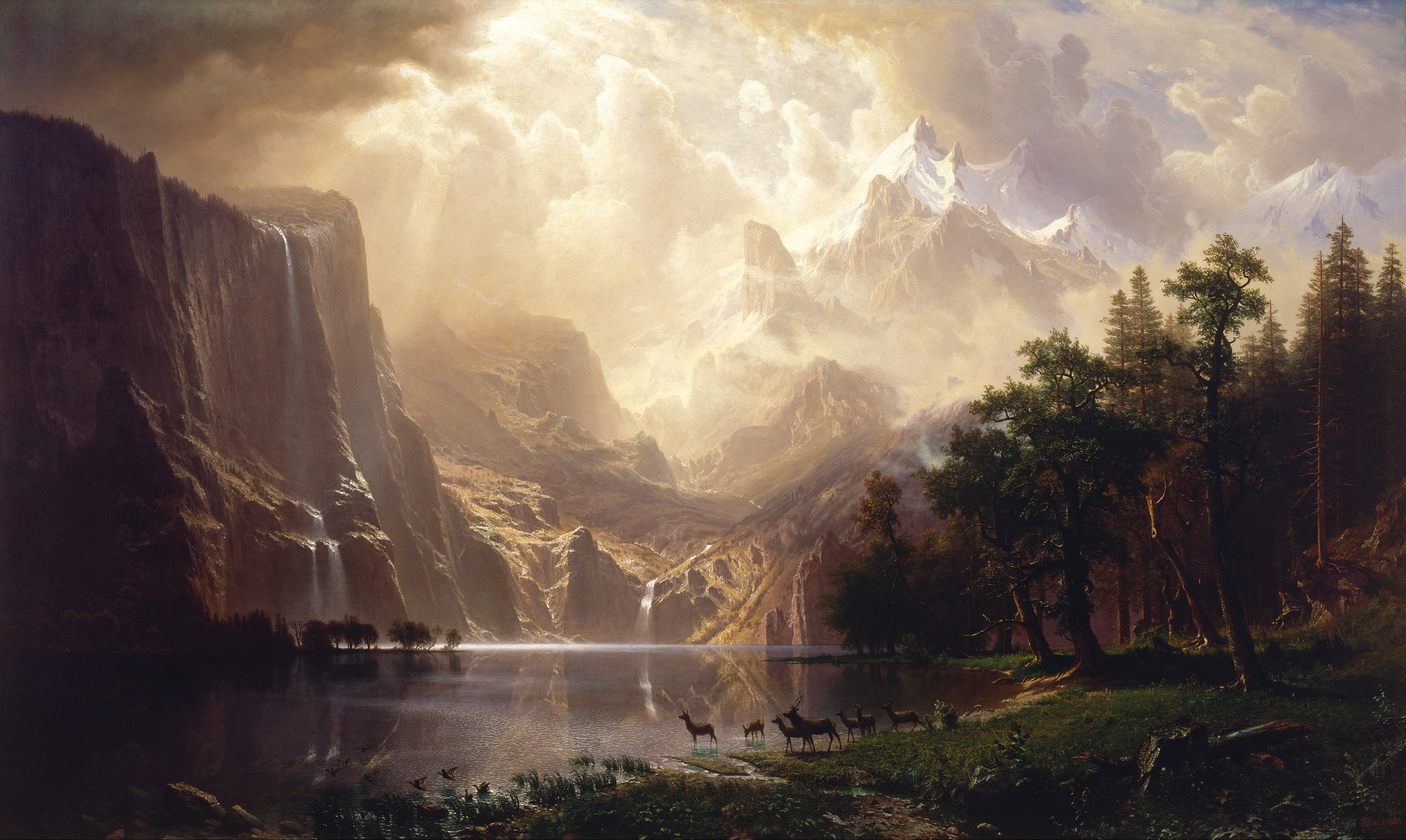
Landscapes are exactly what come to mind when seeing Herwig Scherabon's data visualizations titled 'Income Inequality' representing exactly that. He is an architect turned graphic designer with a focus on a visual commentary on the interplay between the physical/built world and the intangible factors affecting it.
The somewhat sublime visual style of 'Income Inequality' definitely reminds me of the Hudson River School with its dramatic topography and high contrast. While the nature of the two is different there are a few similarities. The source material for 'Income Inequality' is hard data, just as the source material for the painters of a century-and-a-half ago was physical reality. However both needed a process of synthesis, editorial/artistic control, and just time and sweat in order to arrive at a snapshot of what we receive as the final product. It is important to stress synthesis and artistic editing because just as the Hudson River School paintings are often embellishments on what the painters actually saw, or whether they are assemblages of multiple landscapes altogether, dataviz work is no doubt subject to a very similar process. Beauty is contentious y'all.
January 20, 2017 - "Shifting Landscapes Friday"
Landscapes shift. Literally. Continents do not sit still people, we just don't live long enough to see it happen. That's kind of our problem. If you remember last week I referenced "-scapes" as this idea of combining of forms, some of these are able to be seen/sensed better than others. The sun's path across our sky is an example of an easily observed, constantly shifting landscape. And the NY Times has once again produced a beautiful visualization of shadow/daylight patterns of all of NYC indicating how much time each block of the city spends in shadow.
Related, the map also shows how tall each building is and the year of its construction. This is important because the density of New York means that the city regulates daylight access for buildings and new proposed buildings may need to perform shadow impact studies because they obviously affect the shared public realm on the street. The last few years have been witness to a shifting urban landscape in the city with numerous large projects and towers rising across the city. It's hard to imagine their impact before they're built, but once they're there then they're there. So keep your heads up.
January 27, 2017 - "Orient-ation Friday"
Which way is North do you say? Up? Good job, but it wasn't always so and not everywhere. Many of our geography skillz are largely reliant on the assumption that any map we look at is oriented with the North pointing up, even though the original meaning of the word 'orientation' is associated with 'coming from the East'. I for one would be challenged if you were to change the orientation on me. This convention of North being up is convenient but sometimes it is upside down in places like some countries in the Southern hemisphere, which I guess makes sense. Moreover, many early maps from what is now the Middle East were oriented towards the East. All this fascinatingness (yes, fascinatingness is not a real word... blah blah blah, I still typed it twice and spelled it correctly so continue eating your breakfast)... anyway, all this fascinatingness is explained at greater length in a great blog post by Francis Irving.
And if you are more of a hands-on type of gal or guy, then take a crack at this little game by Pentagram that plays with your orientation skillz.
February 3, 2017 - "Ice Friday"
big iceberg
big iceberg closer
more icebergs from a plane, all these images are from NASA's Operation IceBridge whose mission is to study the changes of the Antarctic ice sheet. So does this ice look like it's melting? Does the ice in your ice-water glass look like it's melting?
February 10, 2017 - "Met Friday"
The Met just made available its public domain artworks online free for use under the Creative Commons Zero license, virtually meaning no strings attached. They're hi-res, zoomable and downloadable and there are over 1... 2... 3...375,000 pieces in the collection. Sweet.
February 17, 2017 - "Data Speak Friday"
Be wary of letting the data speak, you might be there all day.
But also be even more wary of letting someone else speak for the data, just like letting someone else speak for you. You've got to have trust. Nathan Yau illustrates with a series of data visualization sketches that all use the same data set but illuminate different aspects of the data.
February 24, 2017 - "All Eyes on the Landscape Friday"
Part of photography's magic is being in the right place at the right time. But what if your eye is in all the places all the time? This is what's behind Marcus DeSieno's project "Surveillance Landscapes". He painstakingly scours thousands of open access webcams, traffic cams, weather cams, sketchy cams that are always watching, always feeding the internet, in order to select a few screen captures to edit and present as photography to the world. So there is that. There are also apparently cameras hiding everywhere.
March 3, 2017 - "How Do You Feel This Friday?"
How do you feel?
I feel like I want to be there:
on a mountain,
cold crisp air,
silence save for the wind
(ignore the helicopter with the big camera),
poised, not rushed.
(headphones encouraged)
March 10, 2017 - "Topo Motion Friday"
This is a beautiful video by Oskar Rene Fülöp, a German designer. I love the effectiveness of the limited visual palette and the accompanying soundtrack.
Happy friday y'all.
March 17, 2017 - "Get Out Friday"
Austin Kleon's blackout poetry has been a favorite of mine for a while. This mini-series along with the accompanying John Stilgoe quote seem to be becoming more and more astute within the context of our increasingly noisy world, constantly demanding our attention, notifying us of new happenings, the constant threat of fomo hanging out at every turn. Attention and time are renewable, but naturally limited, so get out of the noise every once in a while and don't let the fomo monster get you. p.s. I think my favorite of the four poems is the first one: "what are you hoping to express if all you see is four walls?"
March 24, 2017 - "Martian Friday"
Happy friday y'all!
Some of us may just live to witness a live feed from one of us is flying above the surface of Mars (or as close to "live" as the speed of light will allow at 100 million miles away, give or take 60 million or so... aka 4-14 min). Maybe one of us will be crazy enough to be doing the flying... crazy. But until then, there is this short 3D film that has been stitched together by Jan Fröjdman from thousands of anaglyph images taken by the Mars Reconnaissance Orbiter that is orbiting (duh!) the planet.
In case you're not familiar with anaglyphs, they are stereoscopic images that split the image into red and cyan channels that you have to look at with a pair of those weird glasses where one lens looks red and the other looks blue, and together you're in 3D!!! The same principle has been used for most 3D movies out there, with the exception of movies like Avatar which use something way cooler. Anyway, Jan's film itself isn't 3D in that sense, but it is in 3D in that the actual 3D topography can be extracted from just some flat stereoscopic images. All that to say, there are some cool landscapes on Mars... except we don't actually know what color they are.
On a side note, Jan's film is a work of love and curiosity. It was created largely quasi-manually in the sense that he had to manually identify thousands of reference points across images in for his stitching software to track. All this work without knowing that there is software out there that will do all that work automatically... Now that there is so much conversation about automation of jobs, it's interesting to think about what this kind of creative effort might also mean.
March 31, 2017 - "Tracking Your Face Friday"
in order to transform it into something else...
3d tracking + projection mapping using high speed projectors = faces on faces on faces
You've seen it done on buildings (which don't move), and maybe on Lady Gaga's face if you watch the Grammys (which also barely moved), but that was an earlier version that couldn't keep up. This new stuff is the real deal.
And this is a little bit about how they did it.
Masks in motion
April 7, 2017 - "My Way or the Highway Friday"
Any of us who have spent any time in the US know highways. There are plenty of other countries with highways, but the US is the birthplace of this spaghetti infrastructure (or circulation system, or vines covering your yard, or a neural network... pick your flavor of an analogy). The way I would define a highway for today's purposes is a controlled-access high-speed road, where access is controlled primarily through on and off-ramps, and it's dedicated only to motor vehicle traffic. Highways are basically pipelines for cars, totally segregated from the outside world in order to facilitate efficient transport of the goods within. That's their goal and they achieve it relatively well.
Now that we spent all this time defining highways, let's pretend that they were gone. Why? Because Jeff Sisson wants y'all to use your imaginations to imagine what could be through his interactive map that allows you to turn off the highways. At its basic level, his logic is that as a bicyclist or pedestrian, highways are irrelevant, so why are they so dominant on all our maps? However, there are broader and more nuanced reasons if you read his description on the sidebar of the map.
This brings us some of the other reasons for imagining that there are no highways. That is as any good urban planner or urban designer today will tell you, highways create very adverse effects on the fabric around them (whether natural or built). Some of the effects are noise, their massive size, and separation/isolation of neighborhoods/habitats. Have you ever walked under a highway overpass? It's not a happy place. This is why Boston buried a section of I-93 that ran cut through its downtown core in what was known as the Big Dig (the Boston Globe assesses it 10-years after completion and also includes a nice interactive before/after photo). Seattle is currently in the midst of a similar project, the tunnel for which was just finished this week. So it's somewhat of a trend... even Elon Musk is on board, although it's unclear if we should be burying all our problems like that.
April 14, 2017 - "Noisy Noisy Friday"
Last friday was all about highways one adverse effect of which is noise, and we can of course map that. Enter theNational Transportation Noise Map which was just released a couple weeks ago. Thanks to that, we can now see the entire US highway system (and more) as noise.
The other big ticket category is airports, and airports are cool. As an architect and designer, I nerd out about them a little bit, but boy are they noisy. It's understood that proximity to airports and highways depresses property values, increases health risks, and numerous other effects, but I wonder if anyone has mapped this noise effect to the extent that is seen on this noise map. Because the noise from airplanes around airports is like giant crosses or slashes cutting with sound across most cities and towns (or maybe 'scraping' is more appropriate). You can easily gauge the airport's size and runway layout based on its noise map profile.
We are noisy people. Maybe turn it down a couple notches every once in a while, eh?
April 21, 2017 - "Autofoto Friday"
Do you know all those filters that you use for filtering all of your fotos before posting them to instagram? Of course you do! And if you don't, perhaps it's time for you to install wifi under your rock. You also probably know that not-so-little program called Fotoshop Photoshop. All of the powerful things that you can do in Photoshop are to some degree made easier with a smartphone app and some filters, wow. Now the next leap in this process is something that Adobe and Cornell University have cooked up and published in a research paper recently, and it's a program that can take an initial image and an inspiration image, and adapt the inspiration image's style to the initial image. Sounds a little wishy washy, but just look at the fotos then. They are mighty impressive!
The interesting bit is at the end of the article where the author writes about the possible implications of the proliferation of technologies that enable anyone to create anything to look and sound convincing. That's great and powerful and liberating and simultaneously risky and scary. It's maybe not perfectly fitting in this context, but I'm reminded of the idea that the emergence of each invention is the simultaneous invention of its opposite.
April 28, 2017 - "Following the Stars Friday"
Flying through the night,
Reminds me a little of the spirit of Antoine de Saint-Exupéry.
Flying just a bit higher as day emerges from night,
Reminds me a little of the future.
May 5, 2017 - "Unifying Division Friday"
Division has been getting a bad rap lately, so let's try some productive division for a change. Cell division that is, going from 1, to 2, to 4, 8... to.... voila! A living organism. You're welcome.
Love,
Nature
May 12, 2017 - "Factsfaxfacts Friday"
Oh my goodness there are so many stats and facts on USAFacts about the USA. This is a project initiated by Steve Ballmer (former Microsoft CEO) who gathered a team of some smart people to assemble and cull through tons of government data and Artefact to organize and deliver it all. This is a journey of making sense of all the publicly available data collected by the government about the country. The value here is making the information accessible. A few interesting points: the data source is exclusively government collected data, the authors claim zero bias and no agenda other than to provide information although they do admit to an editing process. All in all though, this is quite a stab at aggregating data and coherently presenting it.
May 19, 2017 - "Cloudy Friday"
Seems like everybody has a requisite travel photo these days that's looking out of an airplane window at some clouds, or the wing and some clouds, or the wing and X city below (guilty as charged); but Santiago Borja's shots of storm clouds and lightning (ah! those lightning shots!) and all the rest of that stuff that's in the sky are better. It helps that he's got the pilot's seat view.
May 26, 2017 - "Simplicity on Fridays"
The world is complicated. Everything is complicated. You are, I am, we are, your mom is. On some level we all wish for some simplicity, but not just simplicity, not a reductive plainness, but a simplicity that brings clarity and understanding. There is some proverb floating out there in the ether, saying that if you can't explain something very succinctly then you don't truly understand it. Unfortunately, it is exactly a reductive simplicity that is often the catchiest and the one most likely to cause misunderstandings. I recently came across the following quote by Oliver Wendell Holmes that conveys this hope for clarity in understanding:
"I would not give a fig for the simplicity this side of complexity, but I would give my life for the simplicity on the other side of complexity."
Krista Tippett (whose podcast is wonderful and thoughtful and please don't listen to it at 3x speed) wrote that haikus represent a craft of words that attempts to achieve this simplicity that doesn't lose the depth and meaning of complexity behind them. Perhaps that is so.
Writing a haiku can be tricky, but thankfully there is an algorithm for that (the next "there is an app for that"), by none other than the NY Times. It's a bit of an oldie, but definitely still a goodie.
June 2, 2017 - "Nobody is Here Fridays"
Instead of tracking all of the people like everyone else is doing, Nobody lives here is a map showing all the US census blocks with a population of zero.
The mapsbynik blog has a few maps on different subjects and each time the author dives into background history and contextualizes the maps beyond just data points, which is great! Another good one is the Geography of Hardee's--Carl's Jr restaurants. If you compare the two links, the maps kind of match up to each other.
June 9, 2017 - "Mesmerizing Fridays"
Let's just stare at these waves all Friday long, yes? Just say yes.
June 16, 2017 - "Trippy Friday"
Take a trip through a dreamscape inspired by the lights and sounds of Tokyo. This 360° video is totally otherworldly and yet totally appropriate for Tokyo.
Thanks to Sucheta for the link suggestion!
June 23, 2017 - "Futurist Friday"
The Barbican in London is hosting a Science Fiction exhibit this summer, which is definitely my kind of exhibit! I would spend a highly excessive amount of time there. Too bad I'm not in London... :( Anyone want to sponsor a plane ticket?
Part of this exhibit will show some early editions of a soviet science fiction magazine Tekhnika – Molodezhi (translated as Technology for the Youth), which has been in publication since 1933, and throughout the mid-20th century the magazine put out some amazing and super imaginative artwork. Some of the funky ideas can be seen here, while a more diverse and more interesting artwork can be seen here. There is definitely propaganda scattered in there, duh! There is also emotion, character, and stories!
June 30, 2017 - "Just Google Map It This Friday"
Or Apple map it, or OpenStreetMap it, or Bing map it, or Here map it, whatever map tickles your bones. Let's just be aware that maps are abstractions. We have become so reliant on our newfangled techno-maps that they are often becoming proxies for physical reality. If a place isn't mapped, it doesn't exist. Maps are extremely useful, but they also hide/edit a lot, and a lot of effort that went into their creation. Justin O'Beirne made this side-by-side comparison of the evolution of Apple and Google maps. Each has its own track history of priorities and agendas and graphic decisions.
It helps to build your own sense of direction.